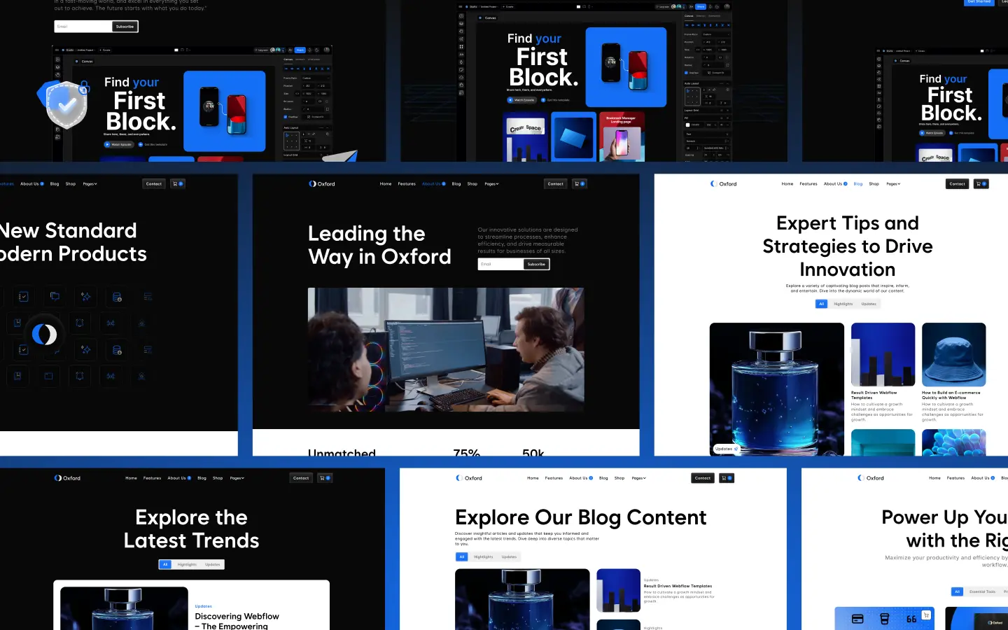
Features of the Oxford Webflow Template
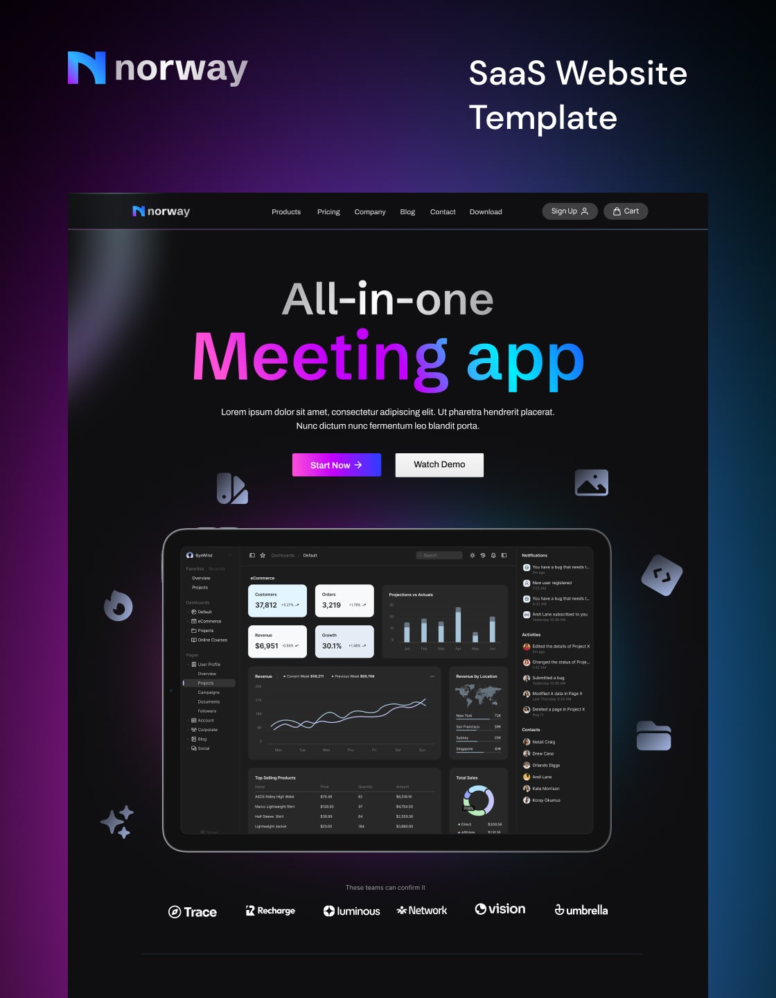
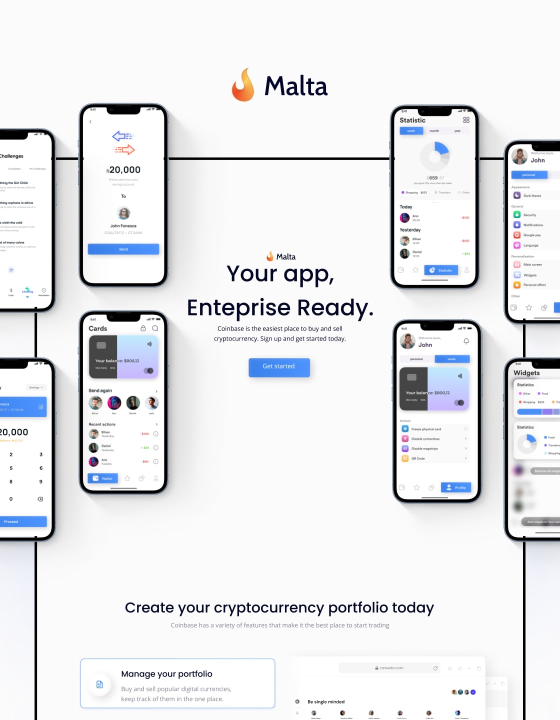
1. Responsive Design
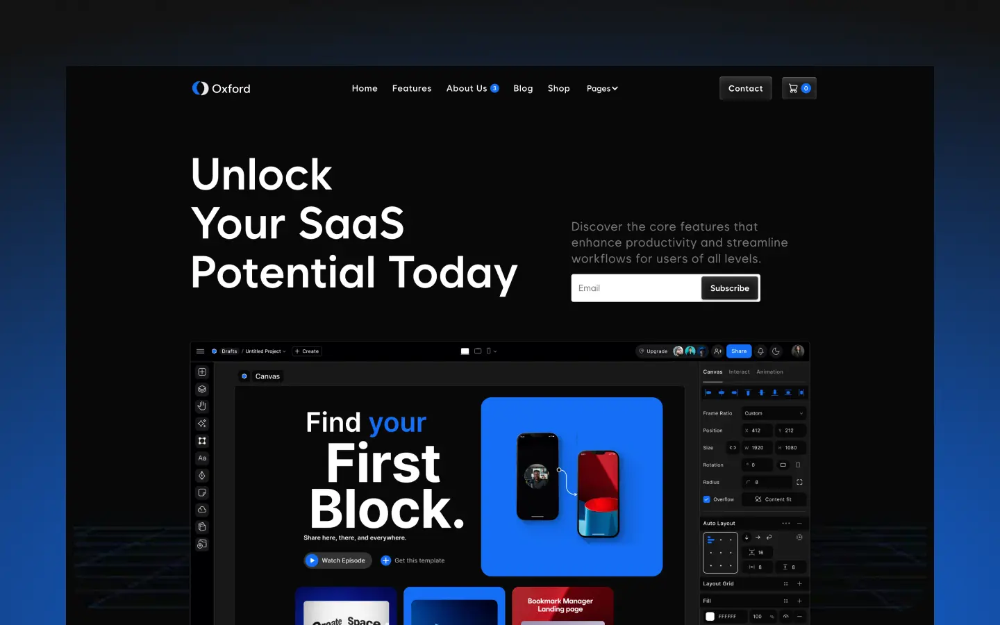
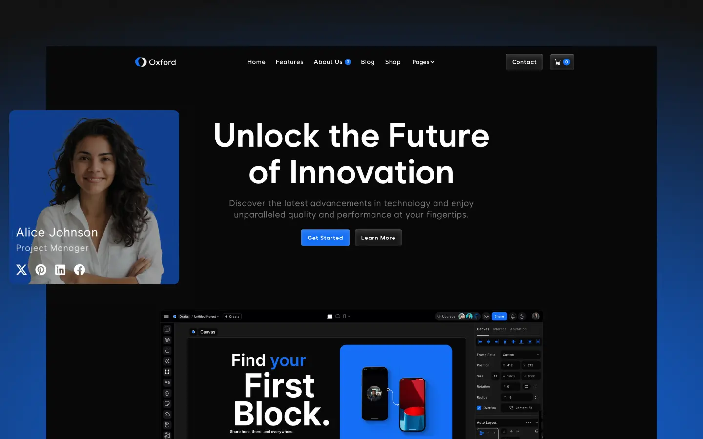
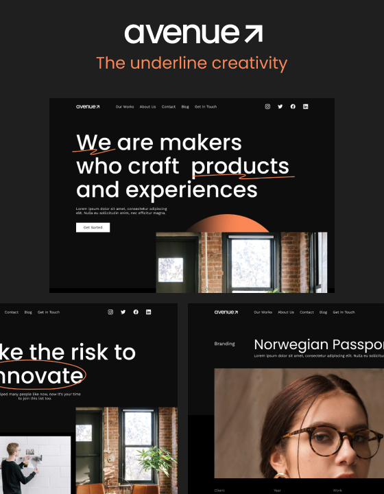
Oxford ensures flawless adaptability across all devices, from desktops to smartphones. Every page layout is crafted to provide a seamless and visually engaging experience, ensuring your audience stays captivated no matter the screen size.
2. SEO-Optimized
Boost your online visibility with Oxford’s SEO-friendly structure. Built with best practices in mind, its clean code and optimized elements enhance your site’s performance on search engines, driving more organic traffic to your business.
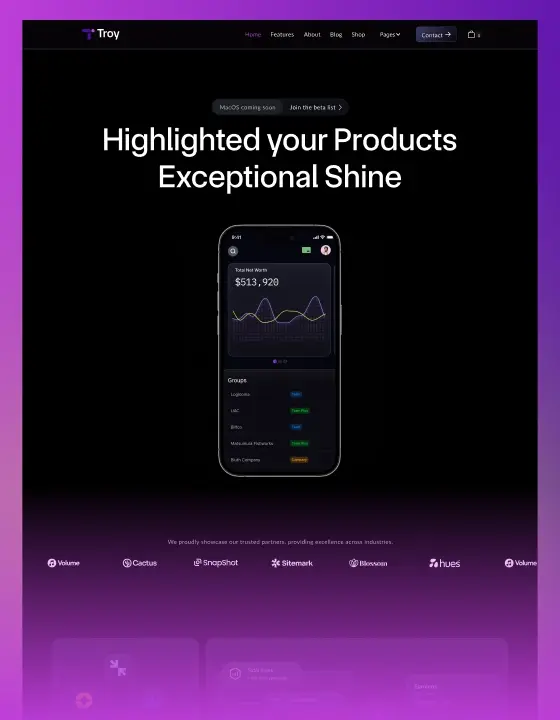
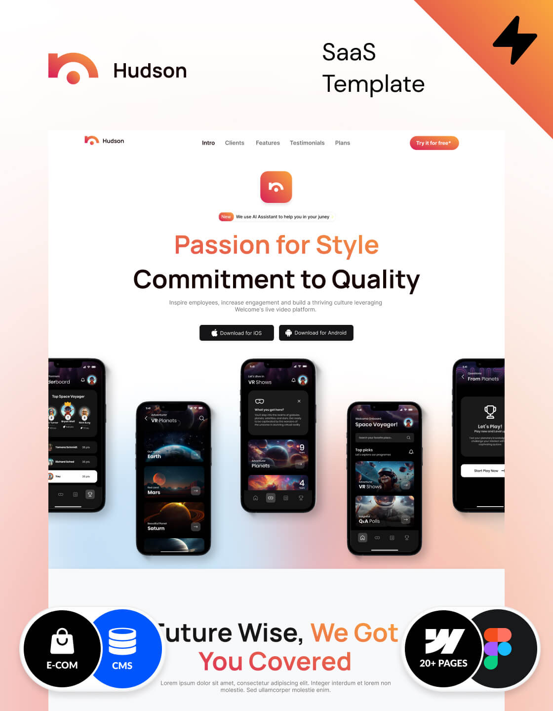
3. Mobile-Friendly
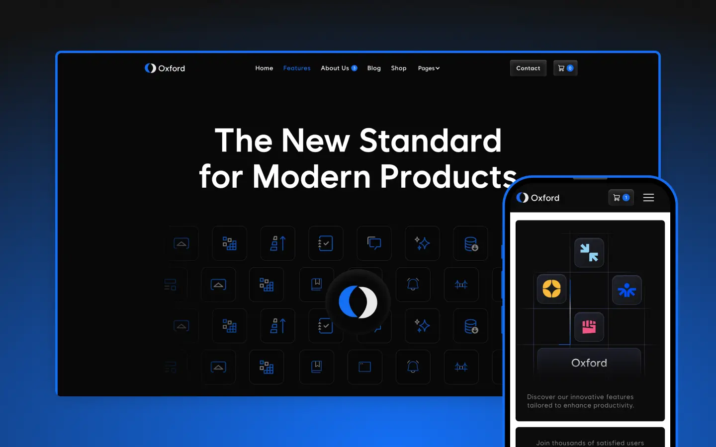
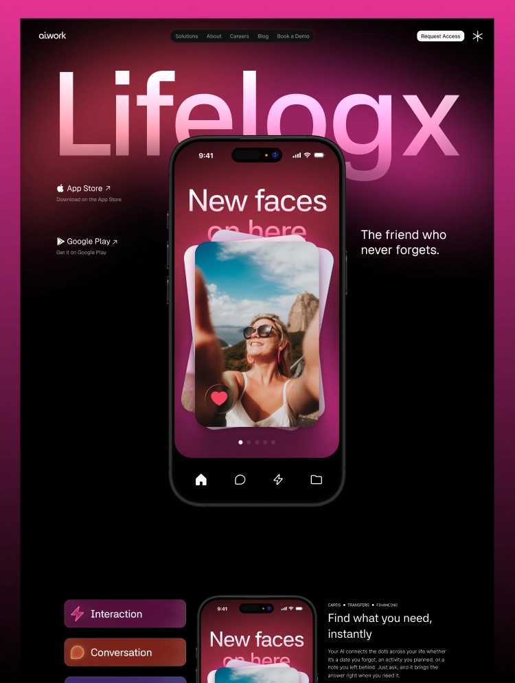
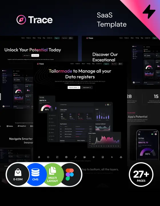
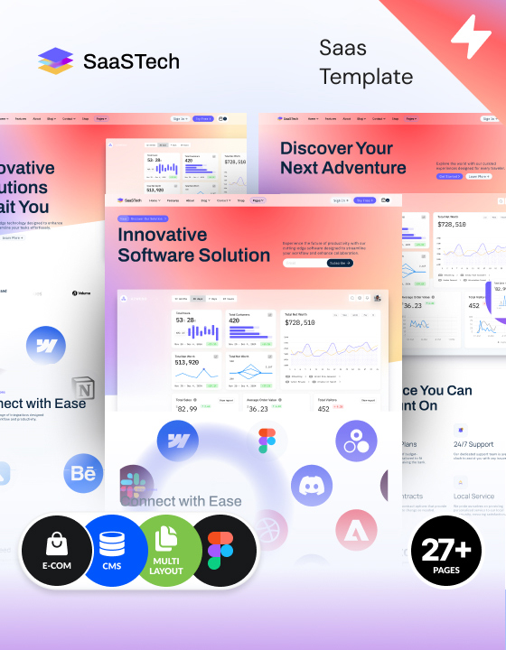
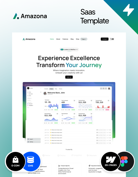
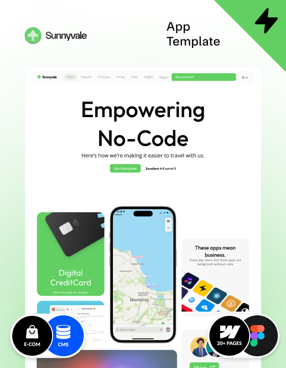
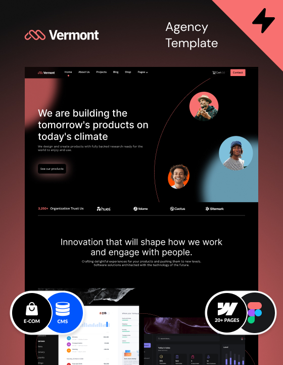
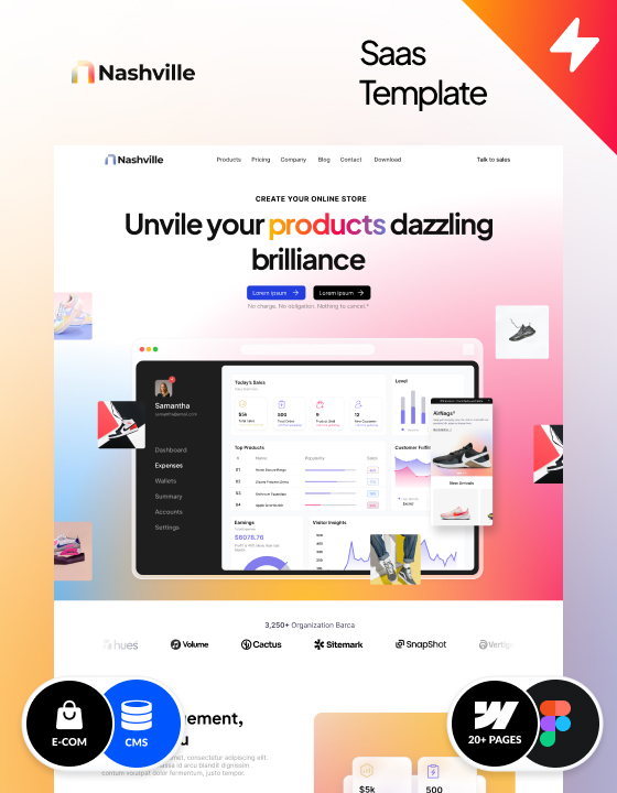
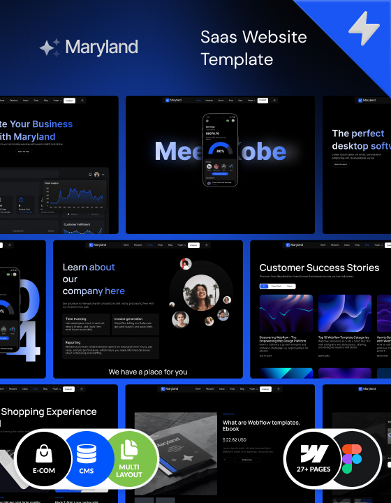
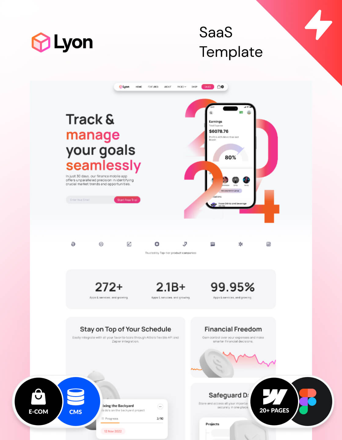
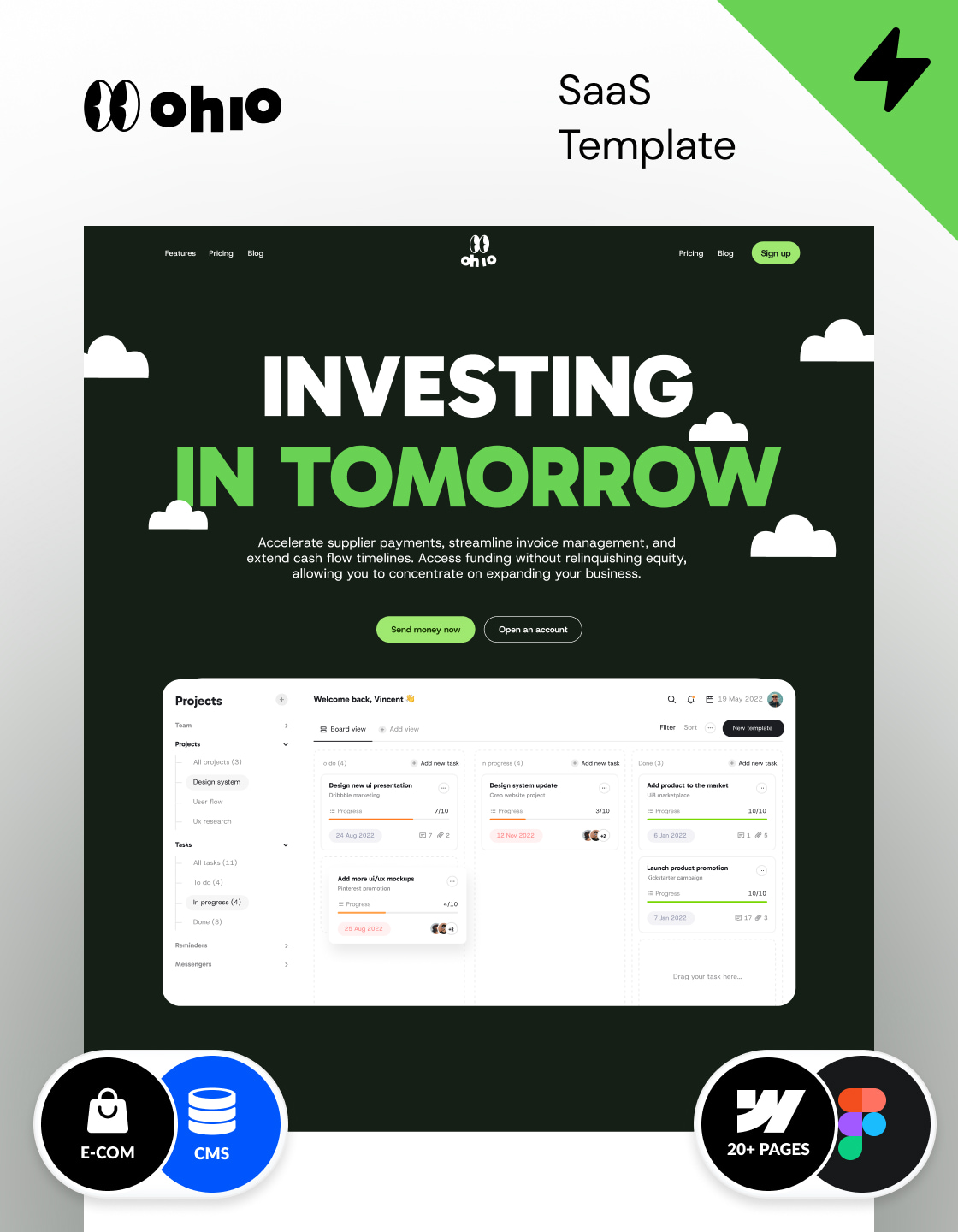
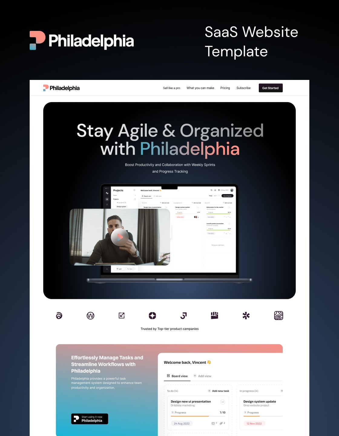
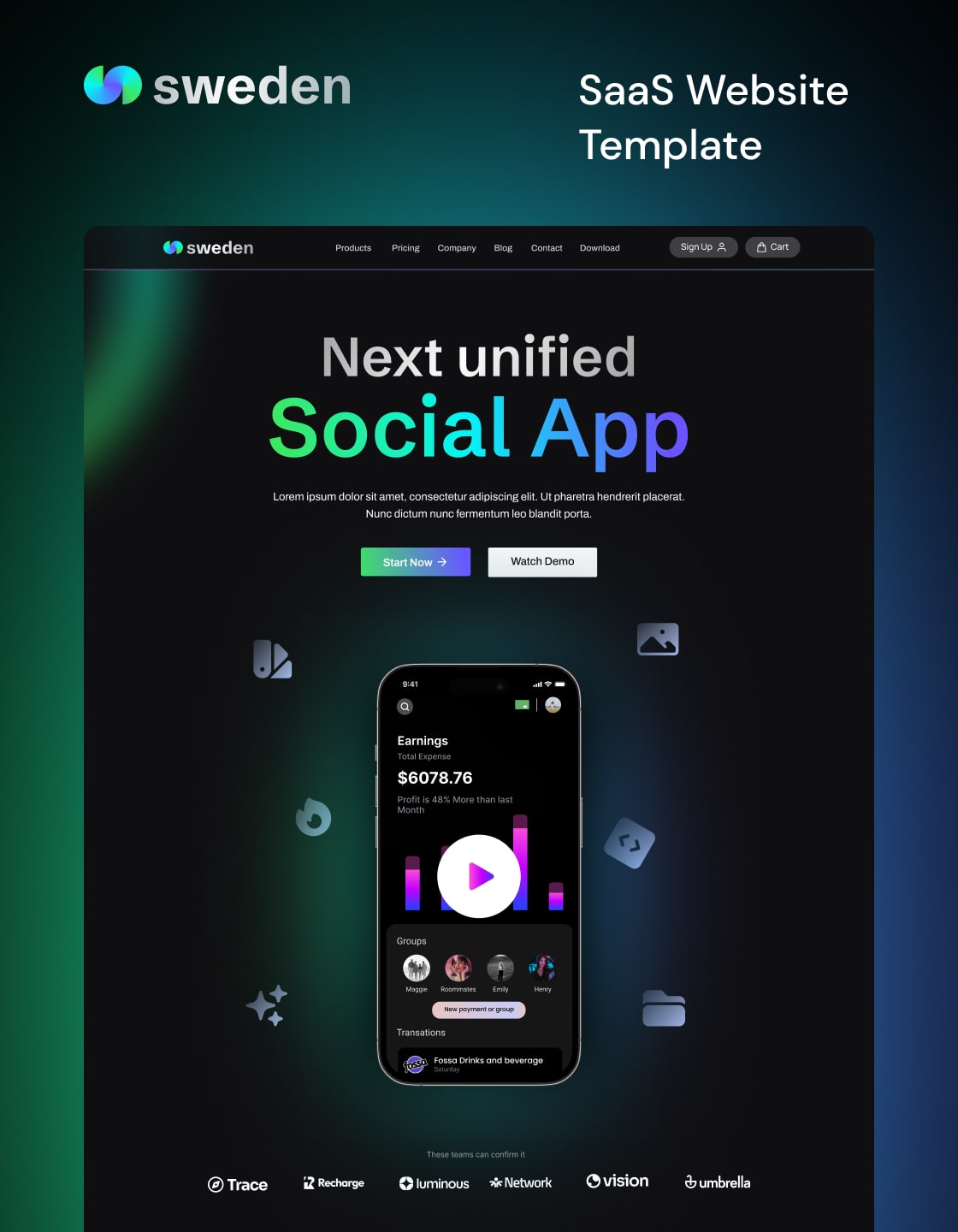
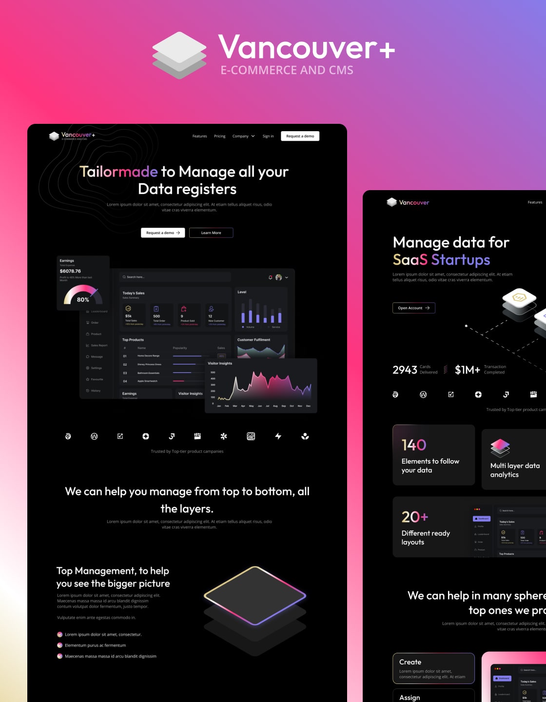
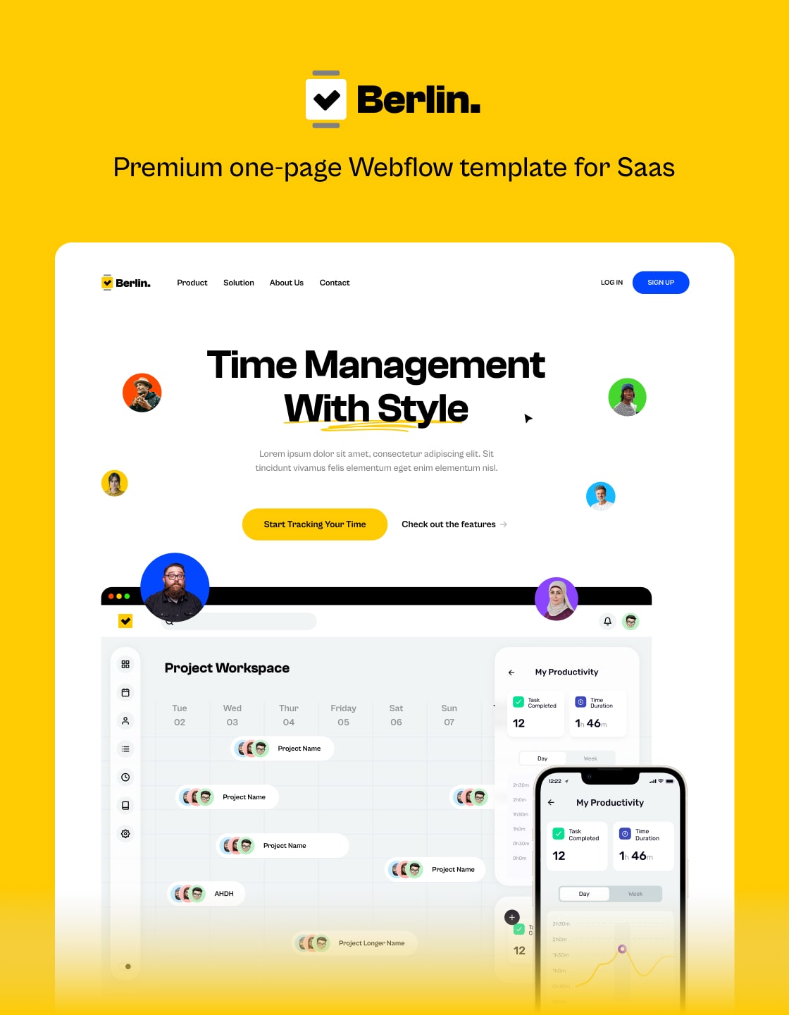
Oxford’s mobile app and web app homepages are thoughtfully designed for handheld devices. The result? A smooth navigation experience and easy access to content, perfectly tailored to the needs of on-the-go users.
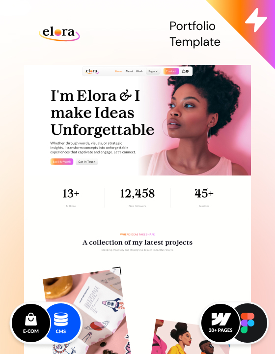
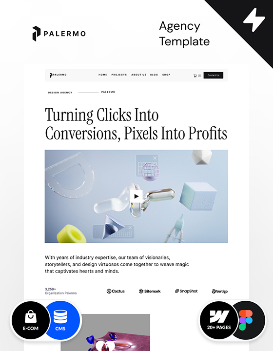
4. Intuitive E-commerce
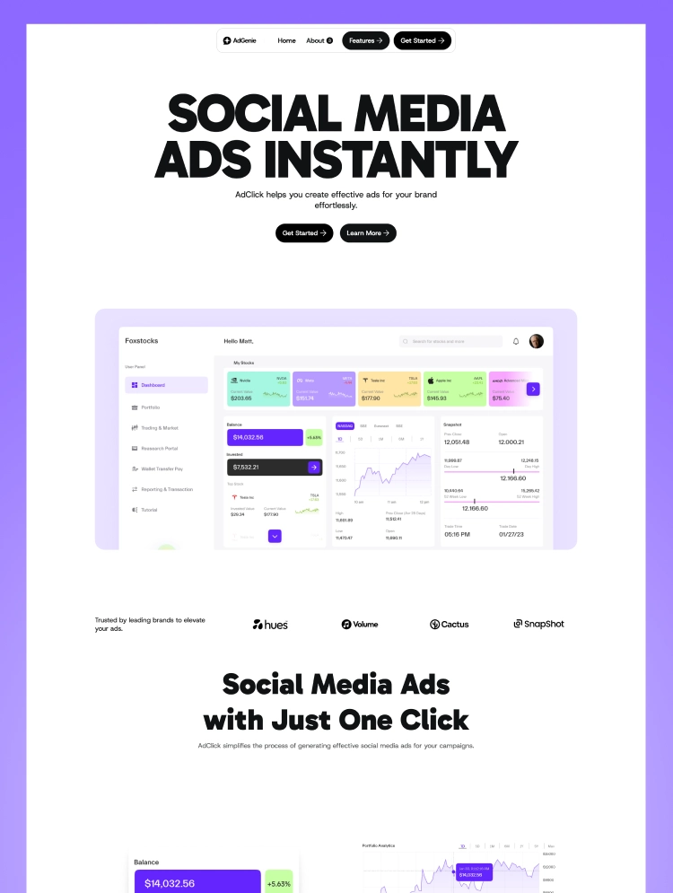
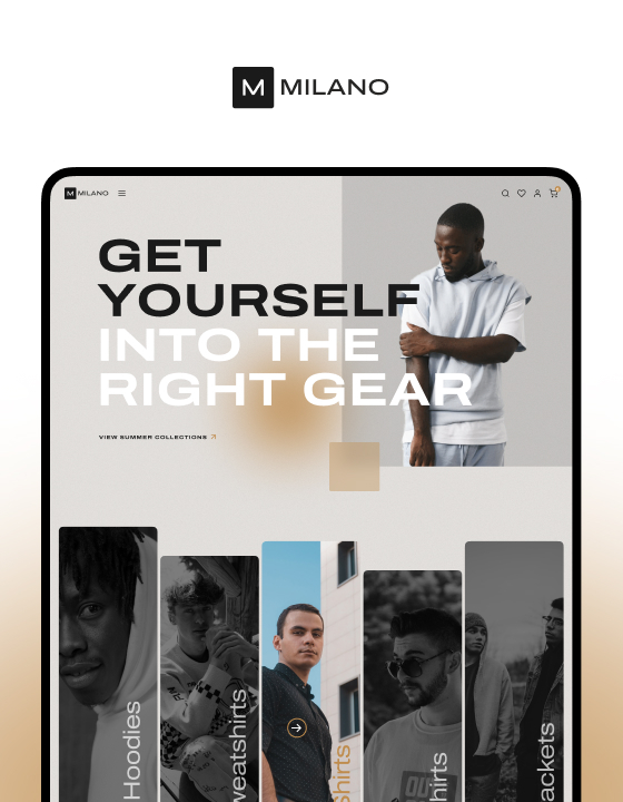
With three unique pricing and feature page designs, Oxford delivers a streamlined e-commerce experience. Guide customers effortlessly through pricing plans and features, helping you increase conversions and drive sales with ease.
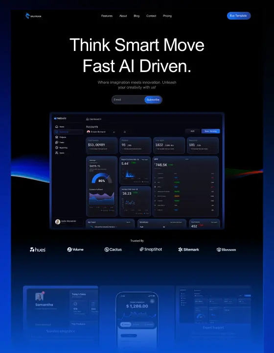
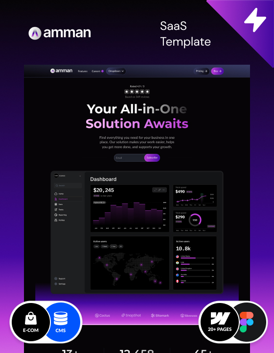
5. Scalable CMS
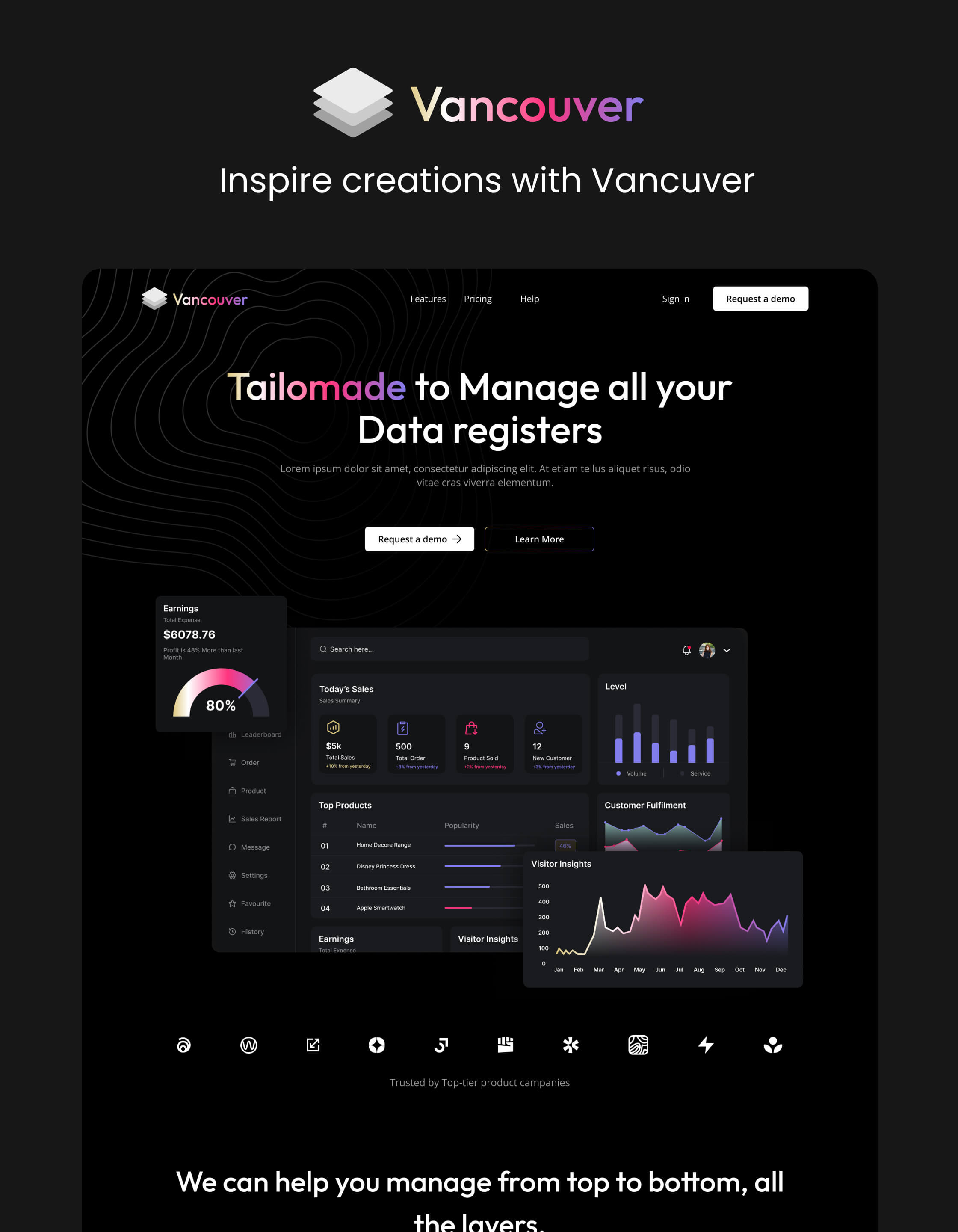
Manage your website with ease using Oxford’s robust CMS. Whether it’s updating product listings, publishing blog posts, or organizing essential content, Oxford empowers you to make updates without any technical complexity, ensuring your site grows with your business.
Support
For any possible issue you might face, find us at tech@azwedo.com and help@wedoflow.com.
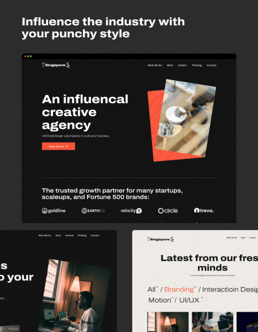
Elevate Oxford's visual storytelling by incorporating paper animations that act as a compelling visual hook, drawing visitors deeper into your content and improving overall conversion rates.
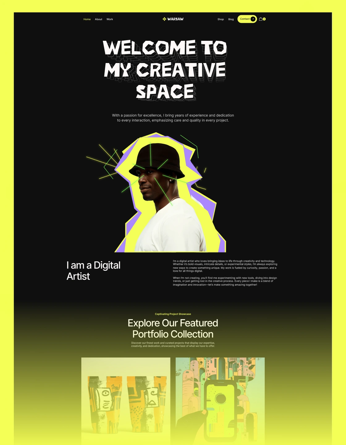
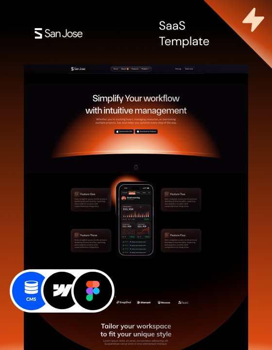
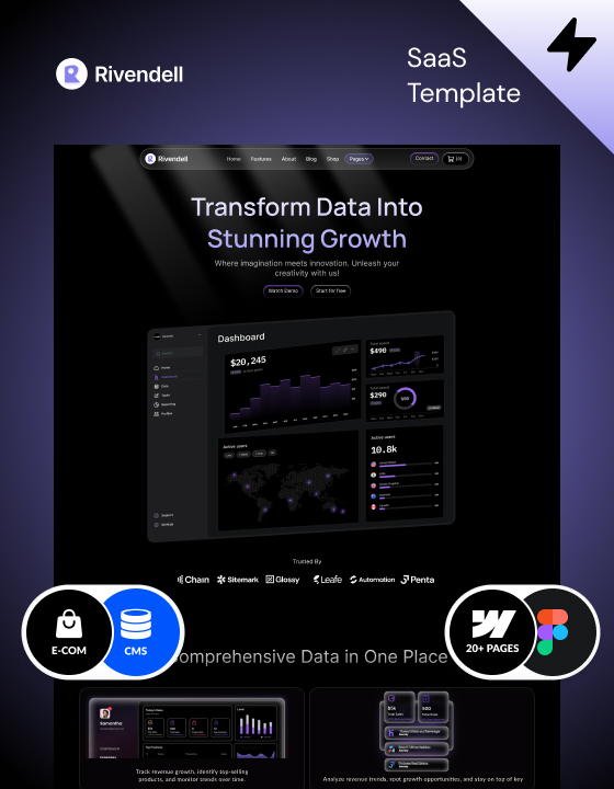
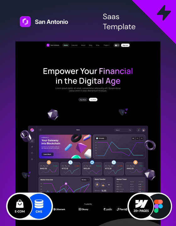
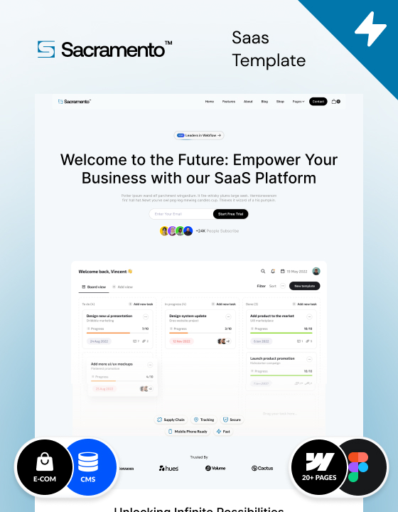
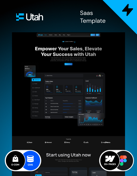
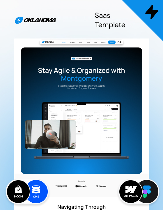
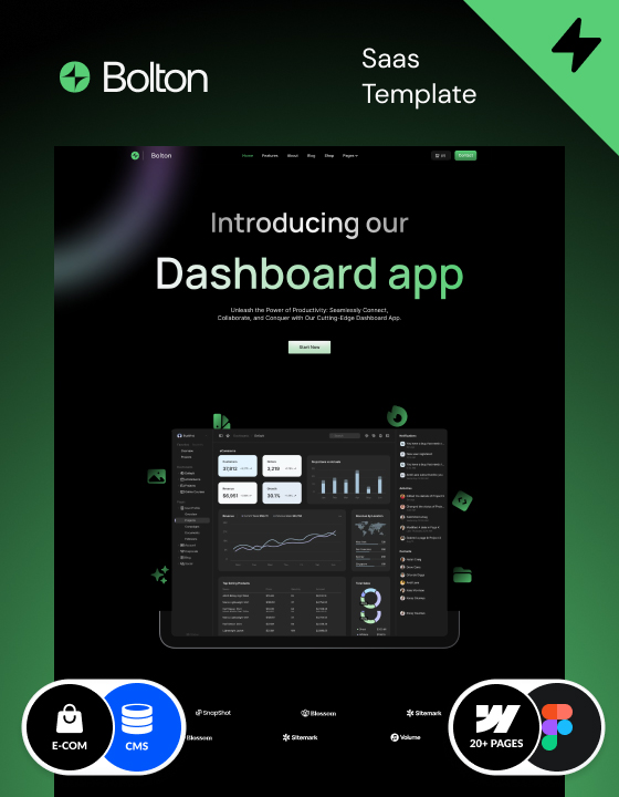
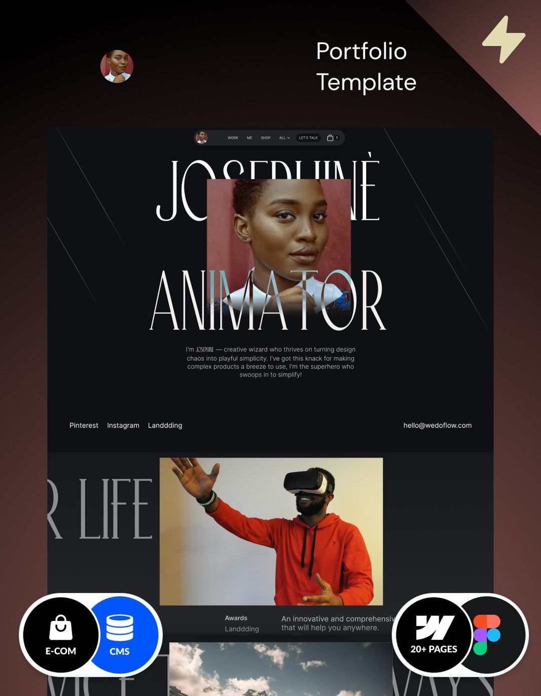
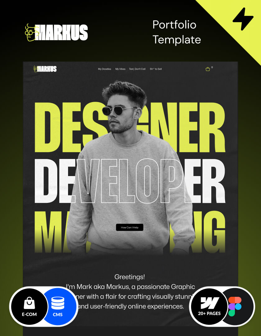
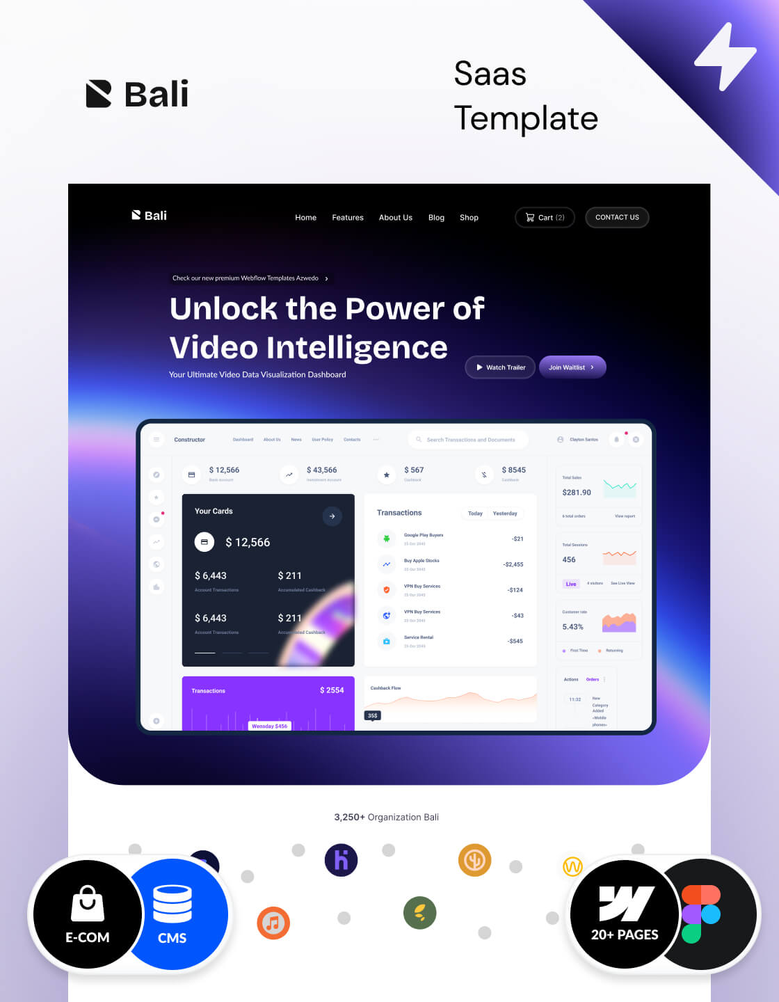
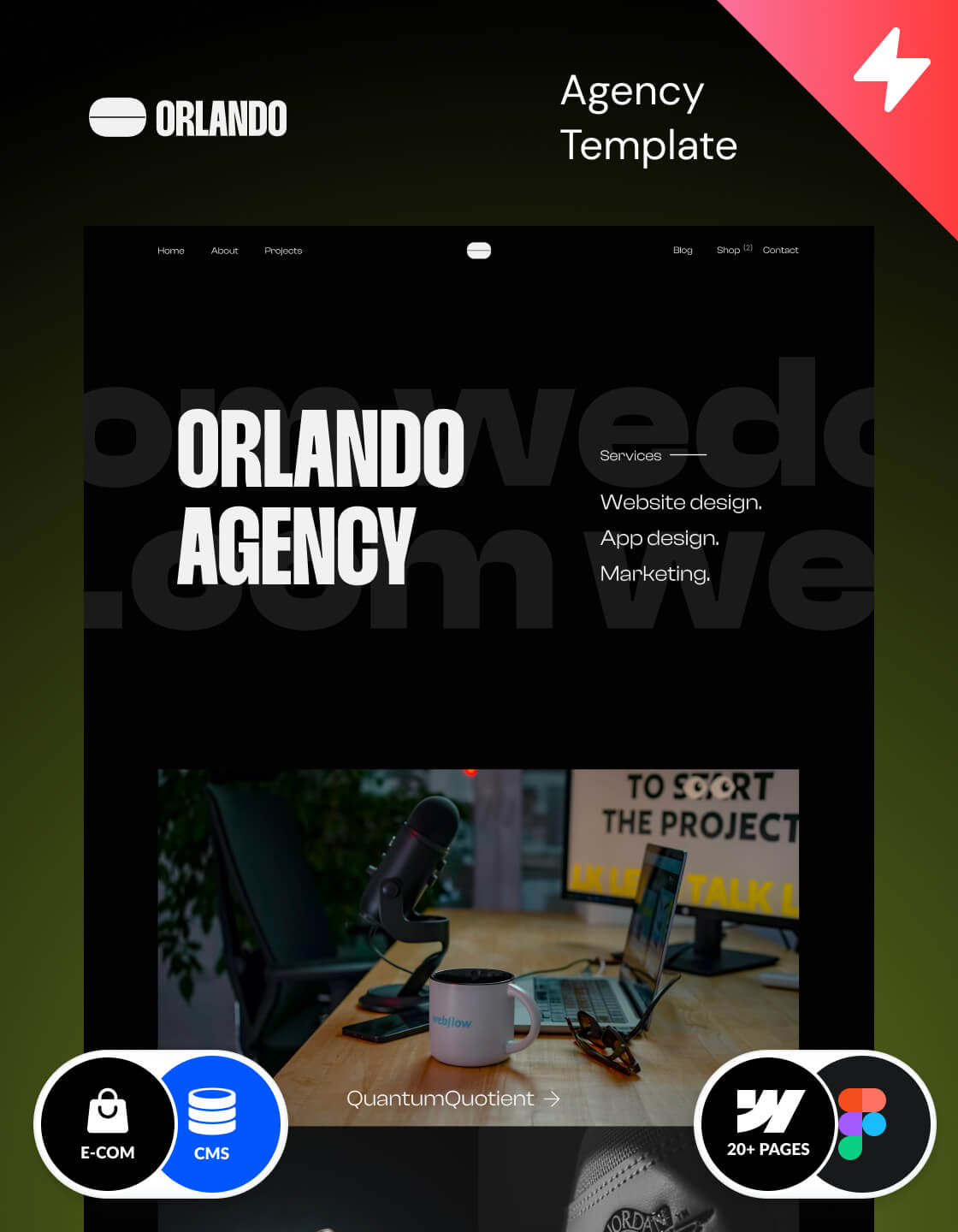
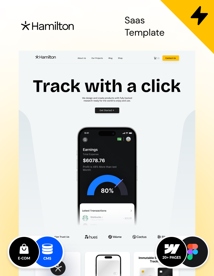
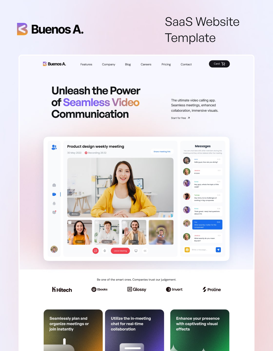
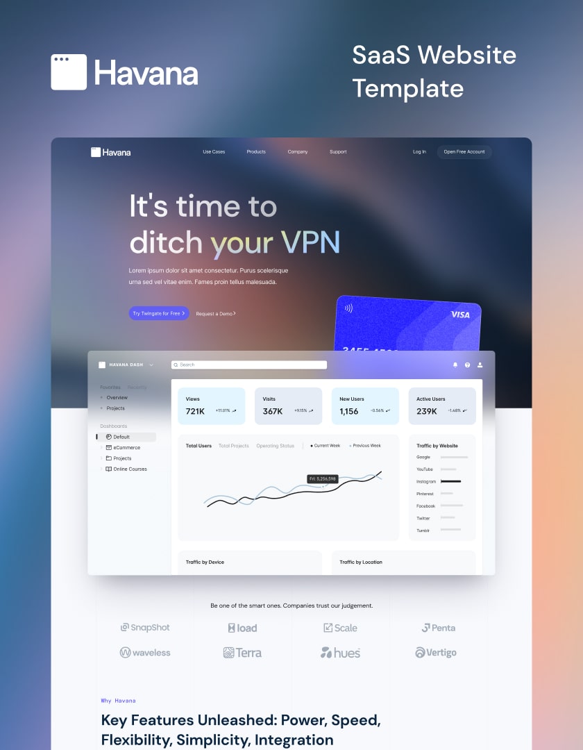
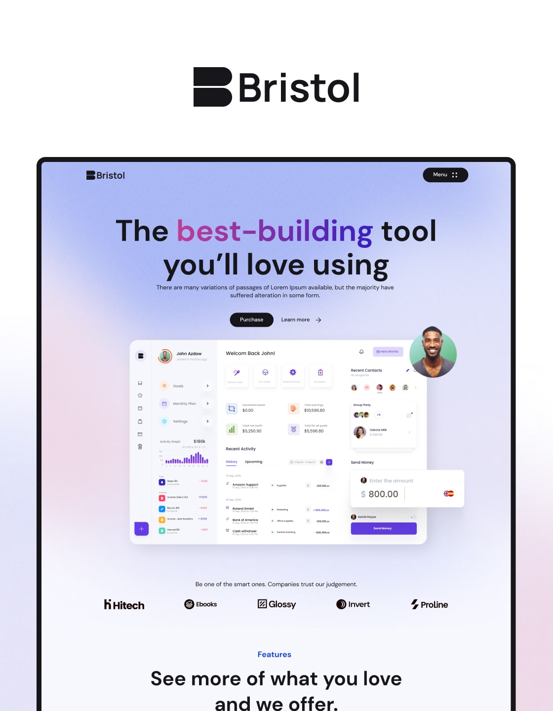
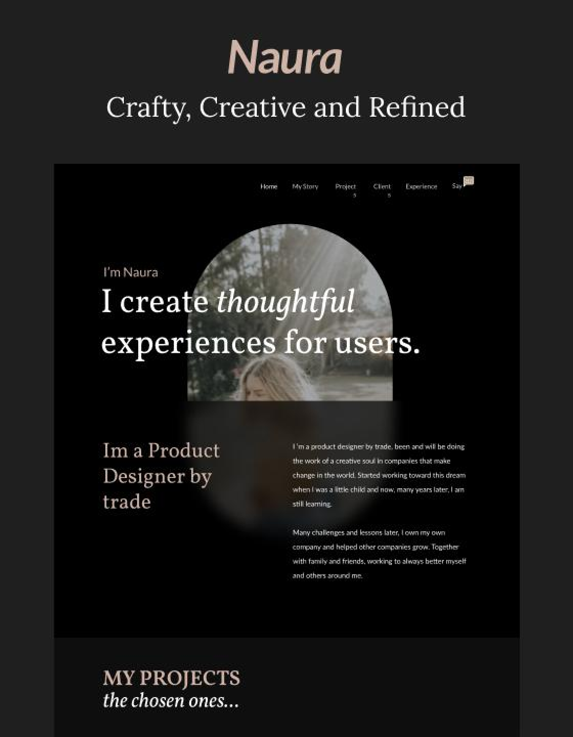
Oxford
Webflow
Technology / SaaS
Template
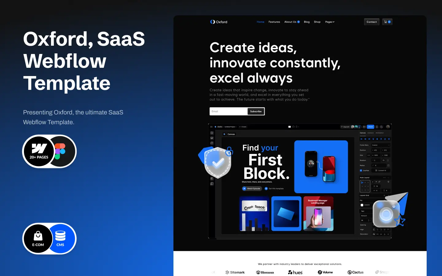
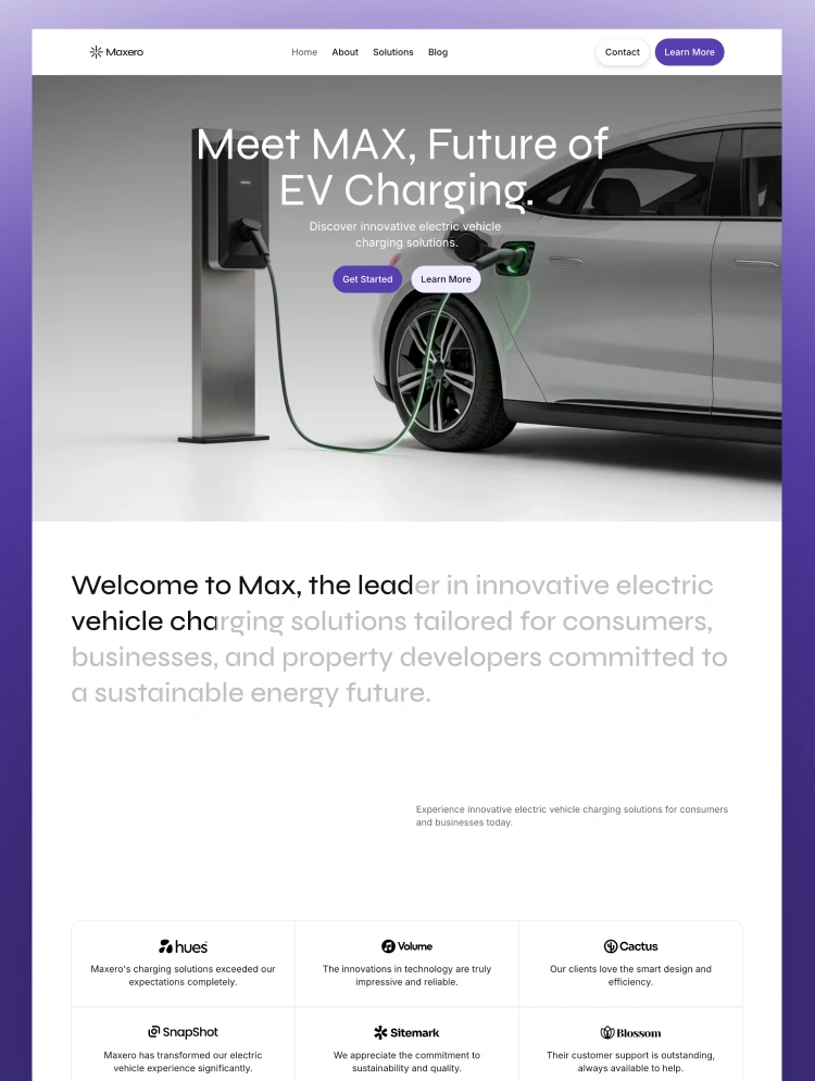
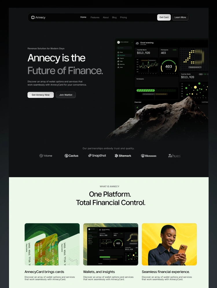
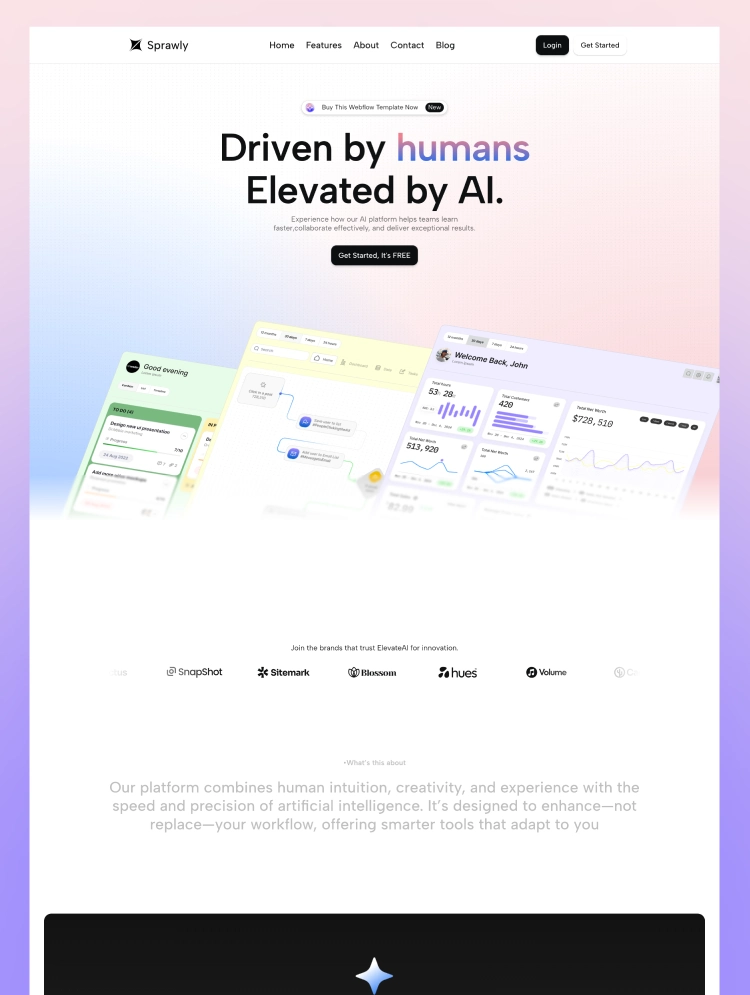
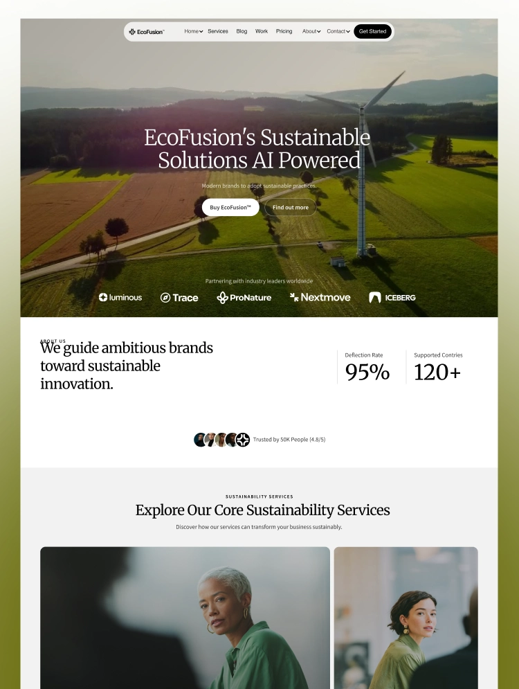
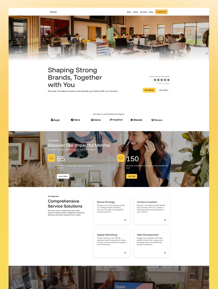
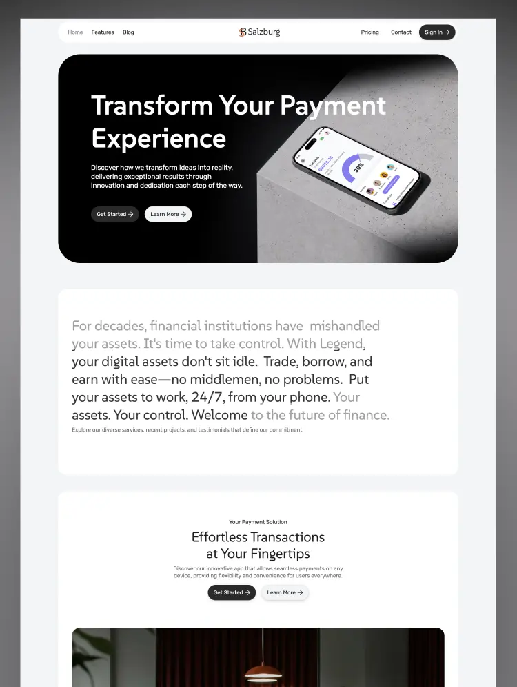
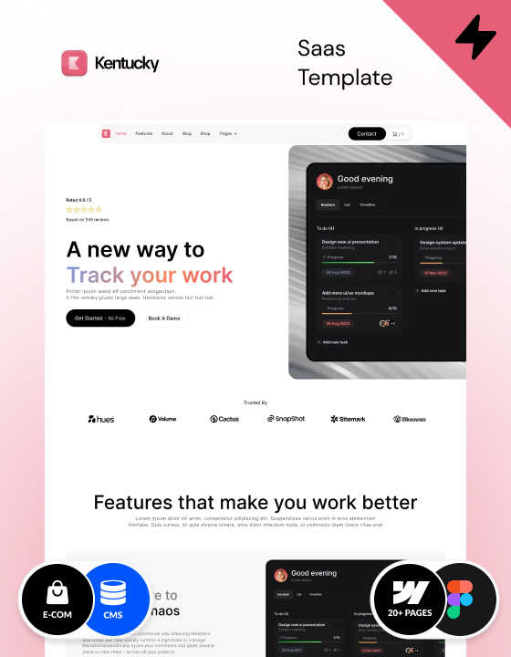
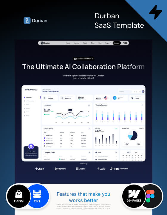
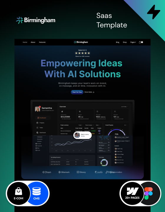
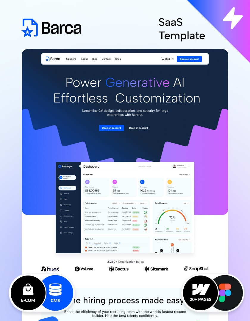
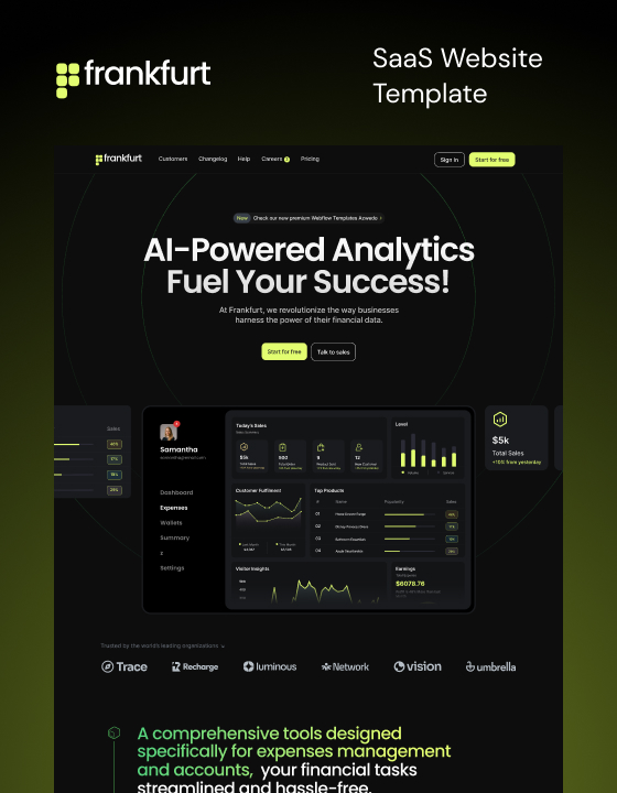
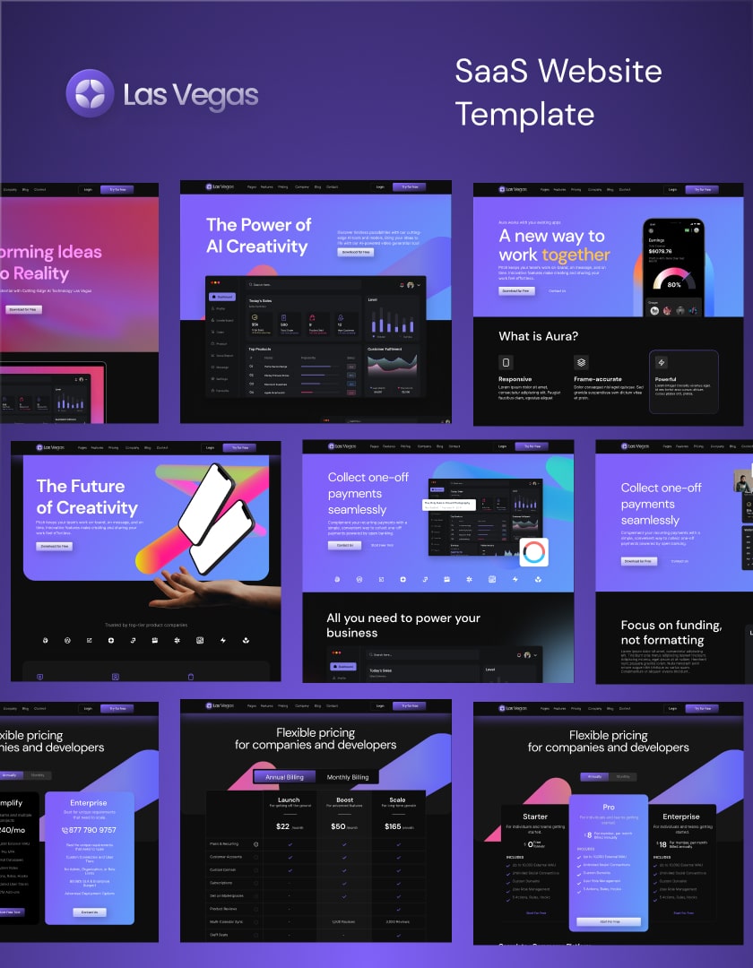
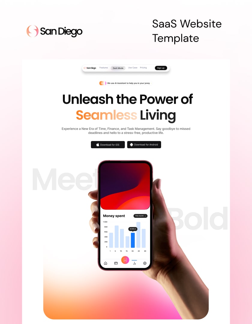
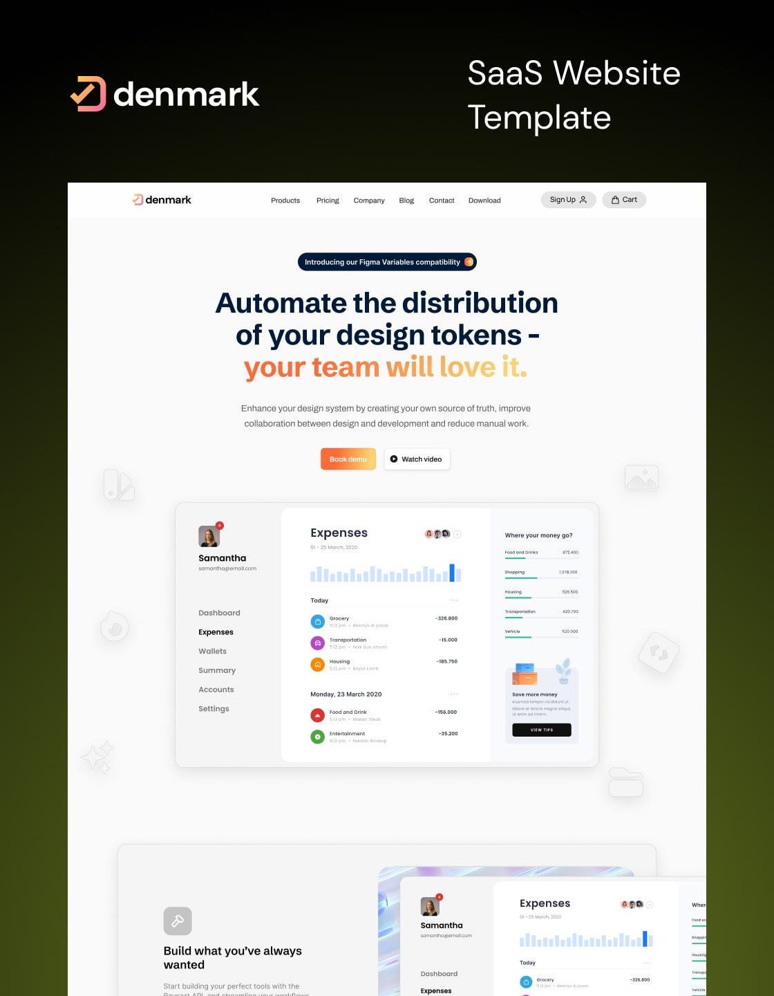
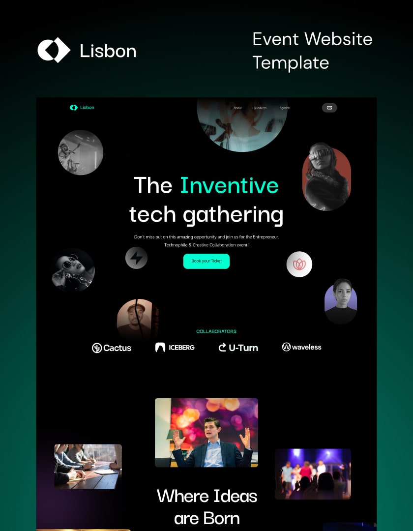
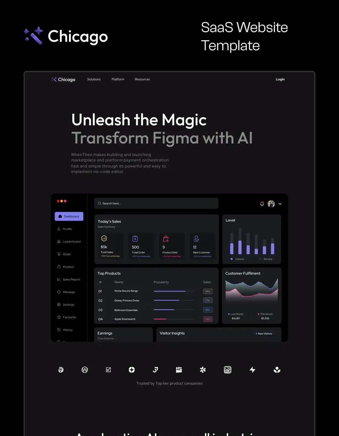
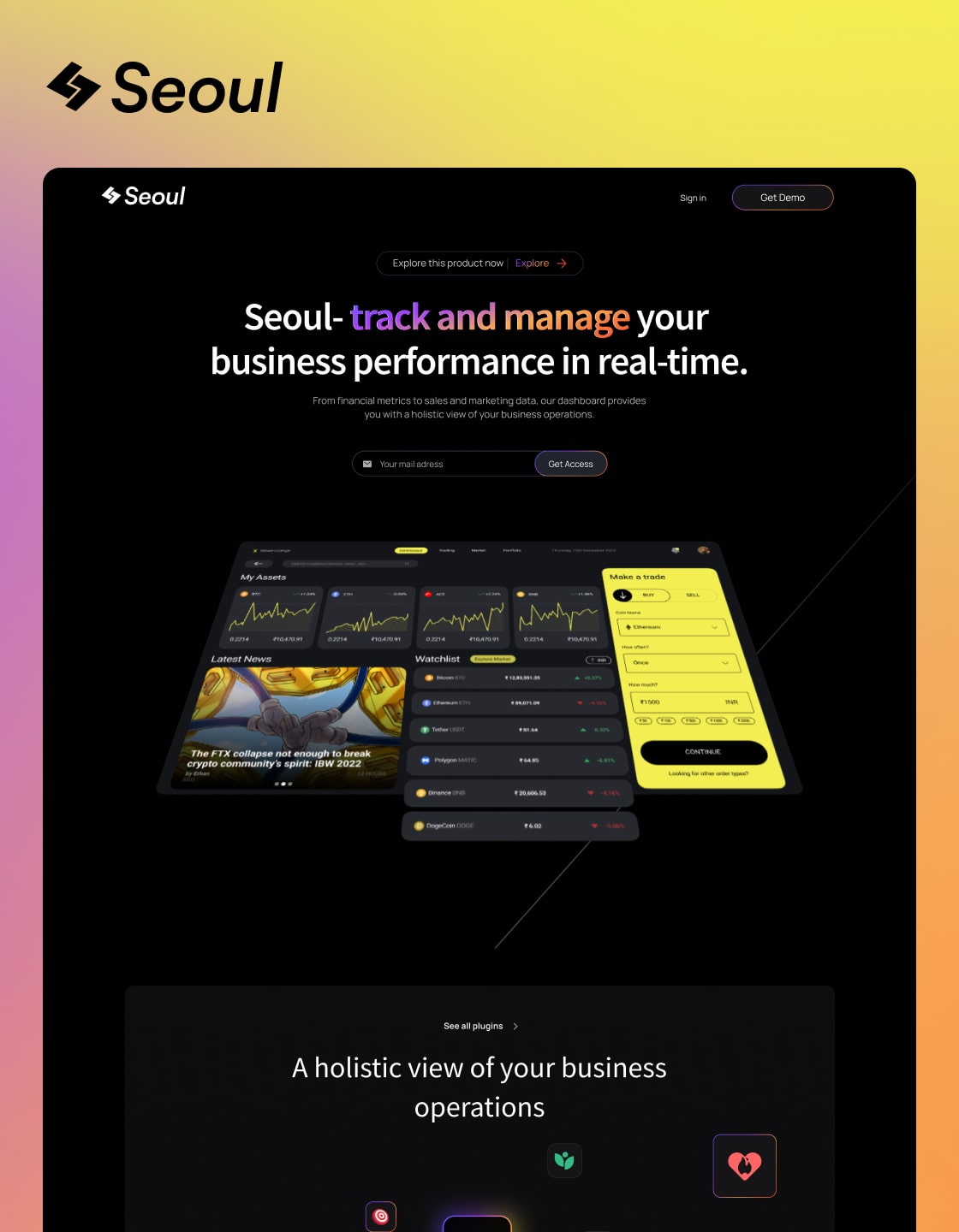
Oxford is a versatile Webflow SaaS template with a sleek dark theme and multipage layout. Designed for responsiveness, SEO optimization, and mobile-friendliness, it features intuitive e-commerce and a scalable CMS for effortless management.
Or Preview in
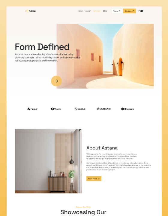
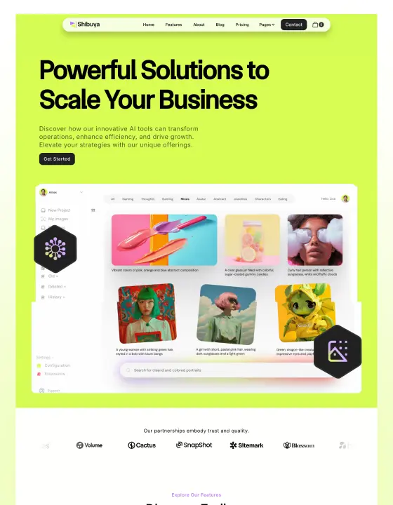
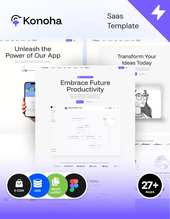
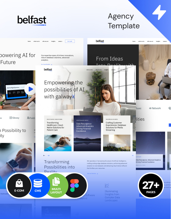
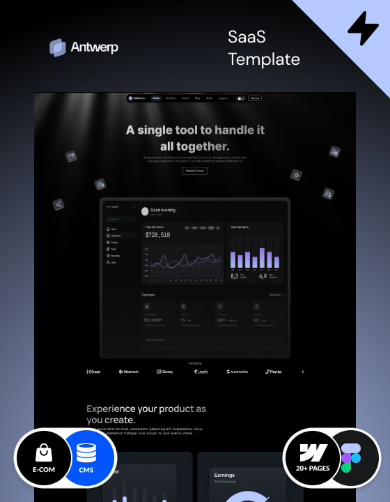
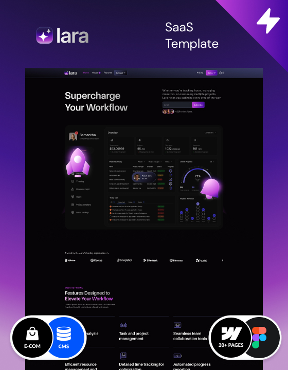
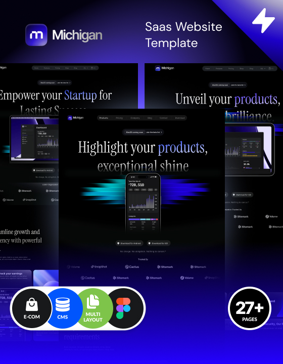
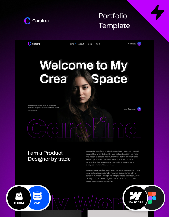
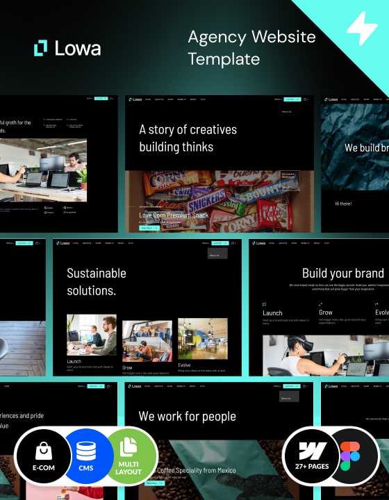
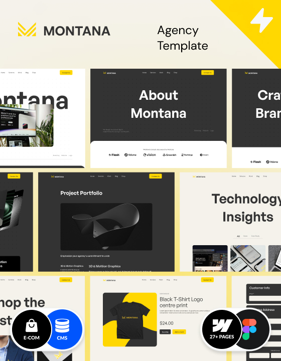
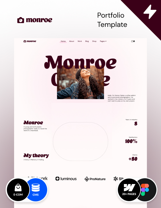
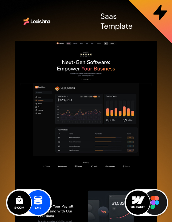
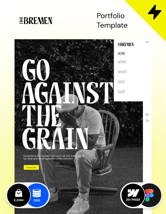
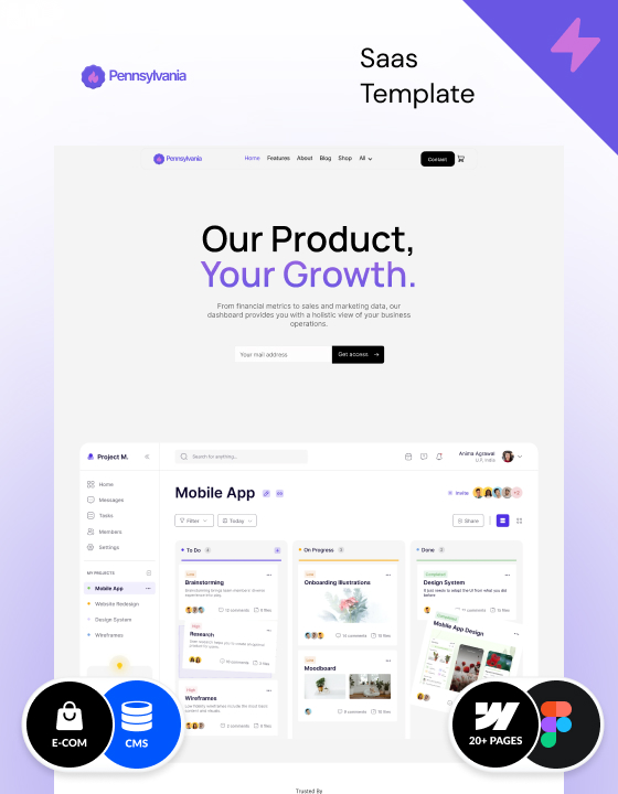
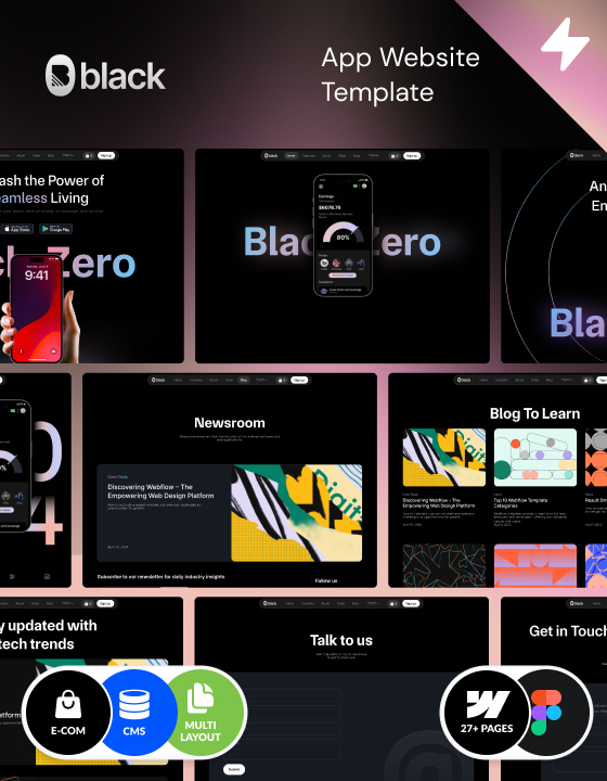
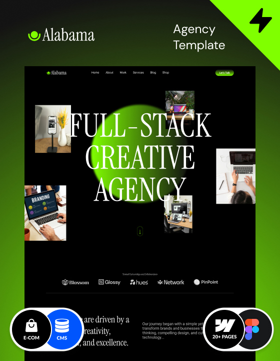
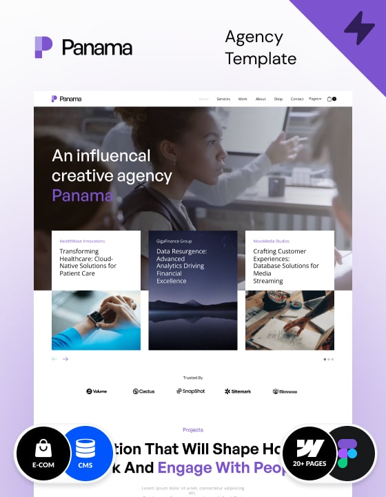
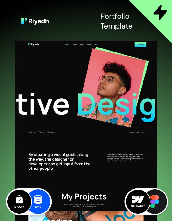
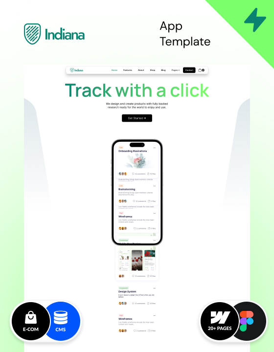
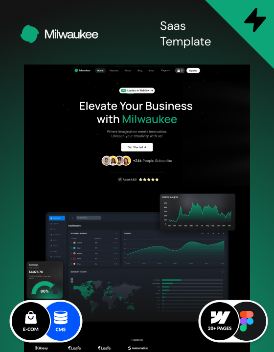
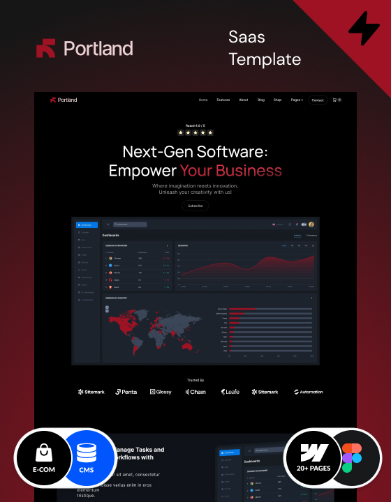
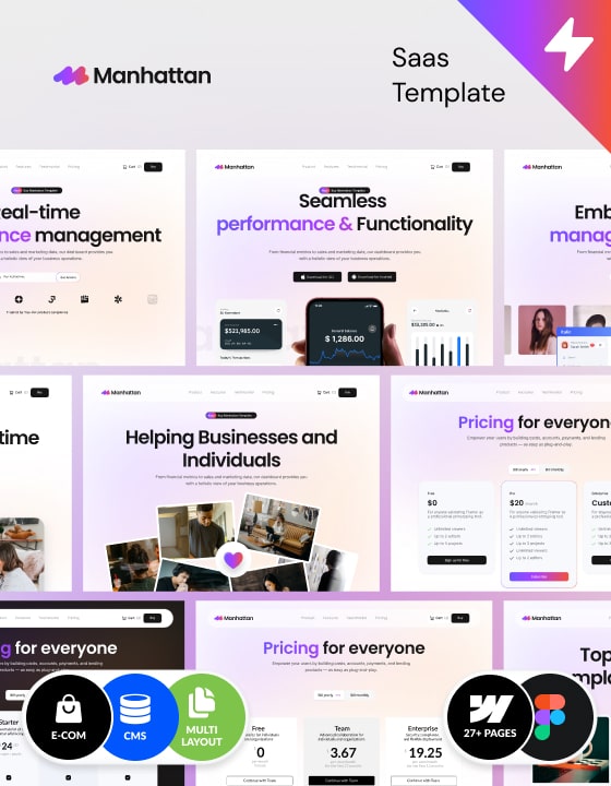
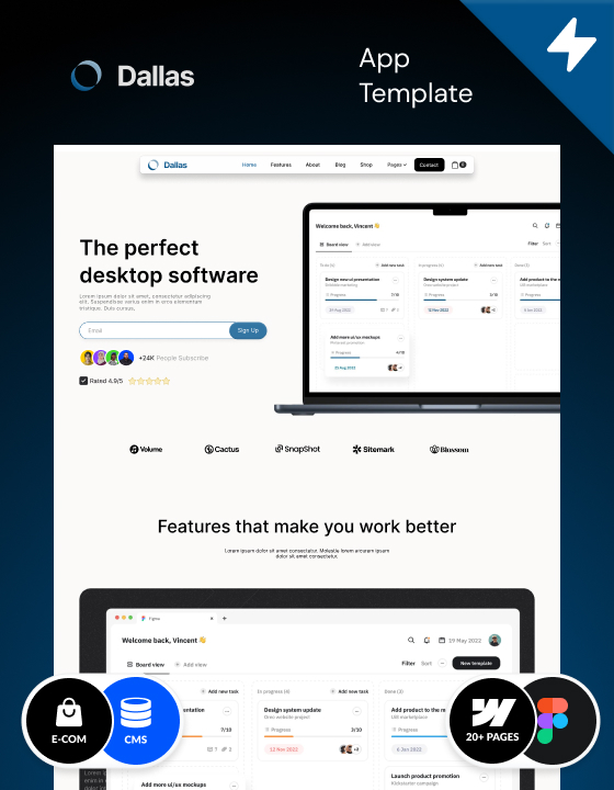
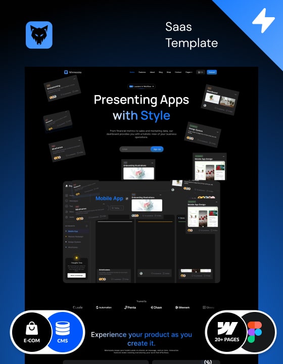
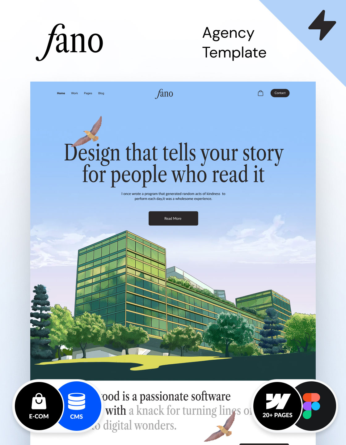
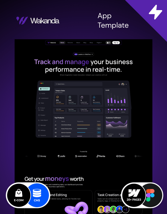
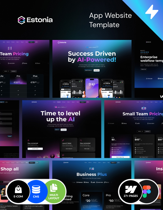
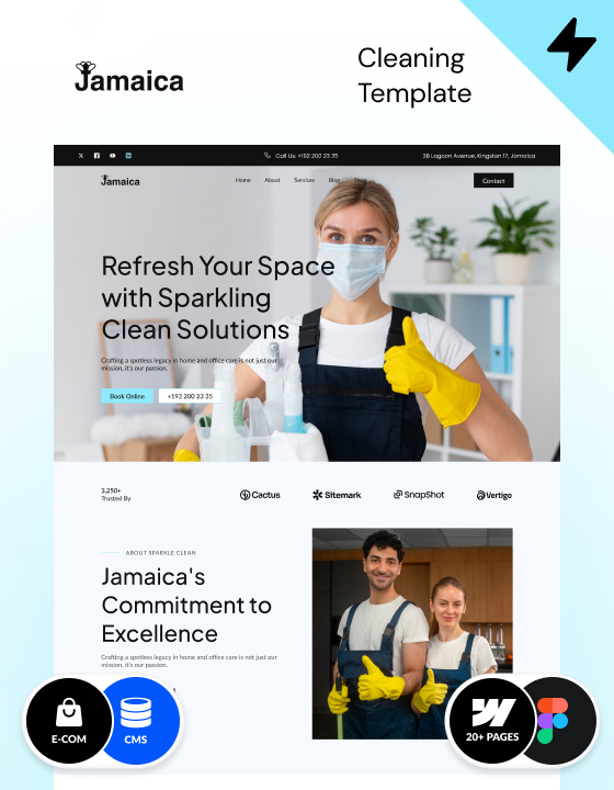
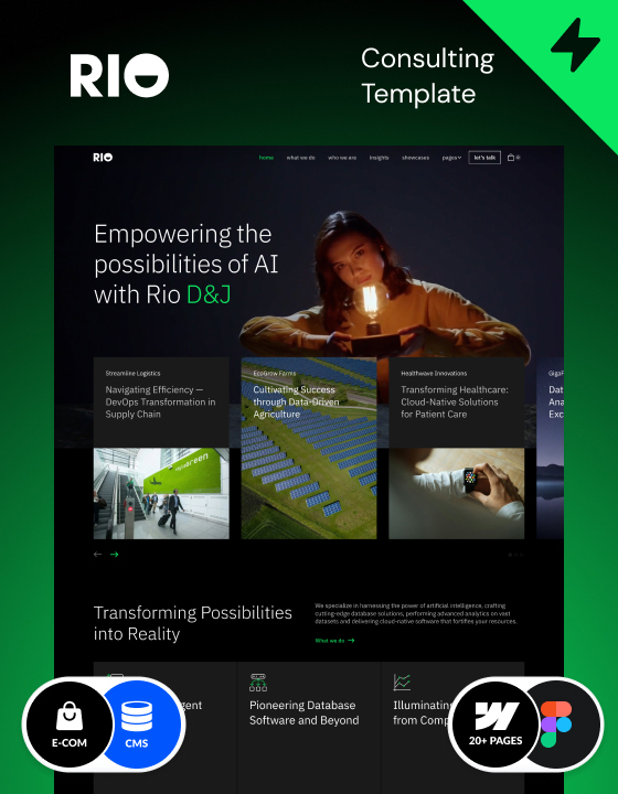
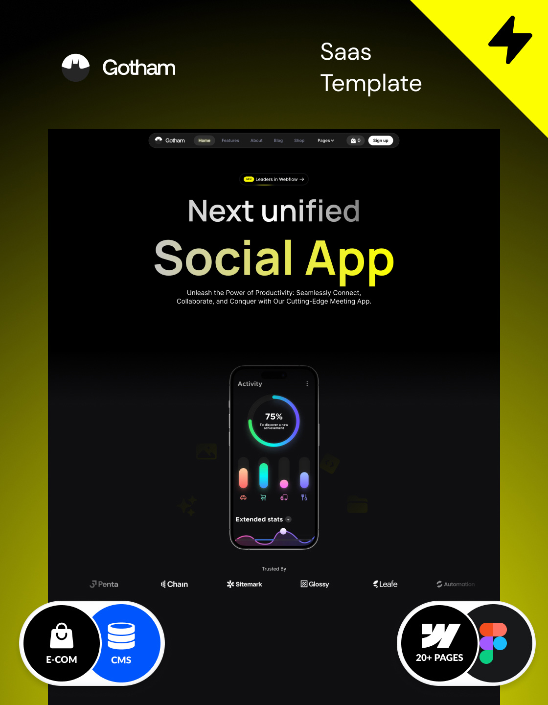
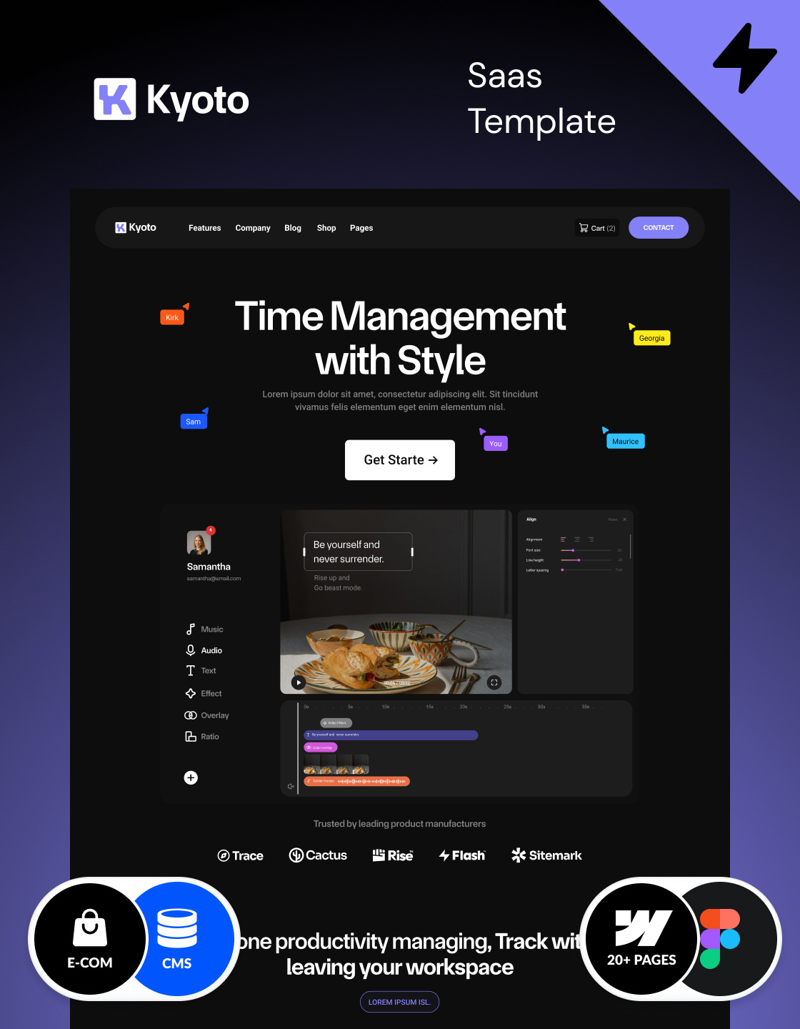
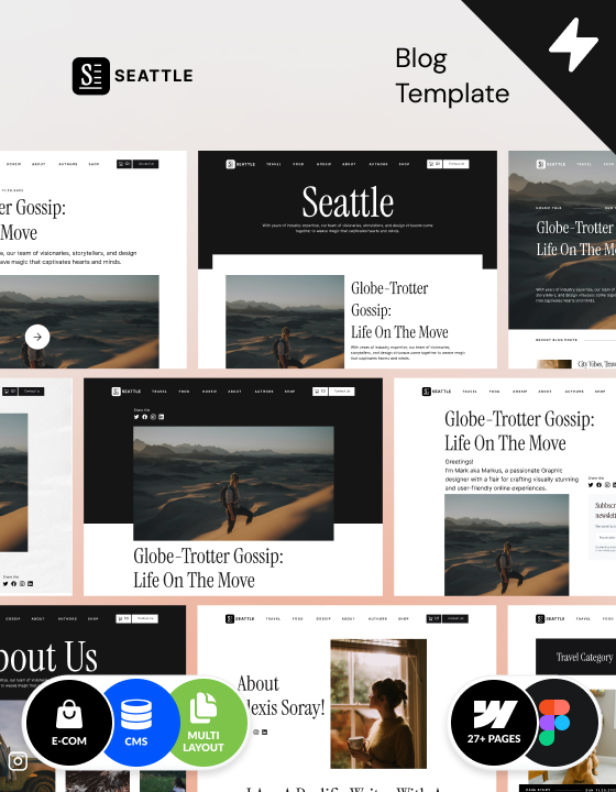
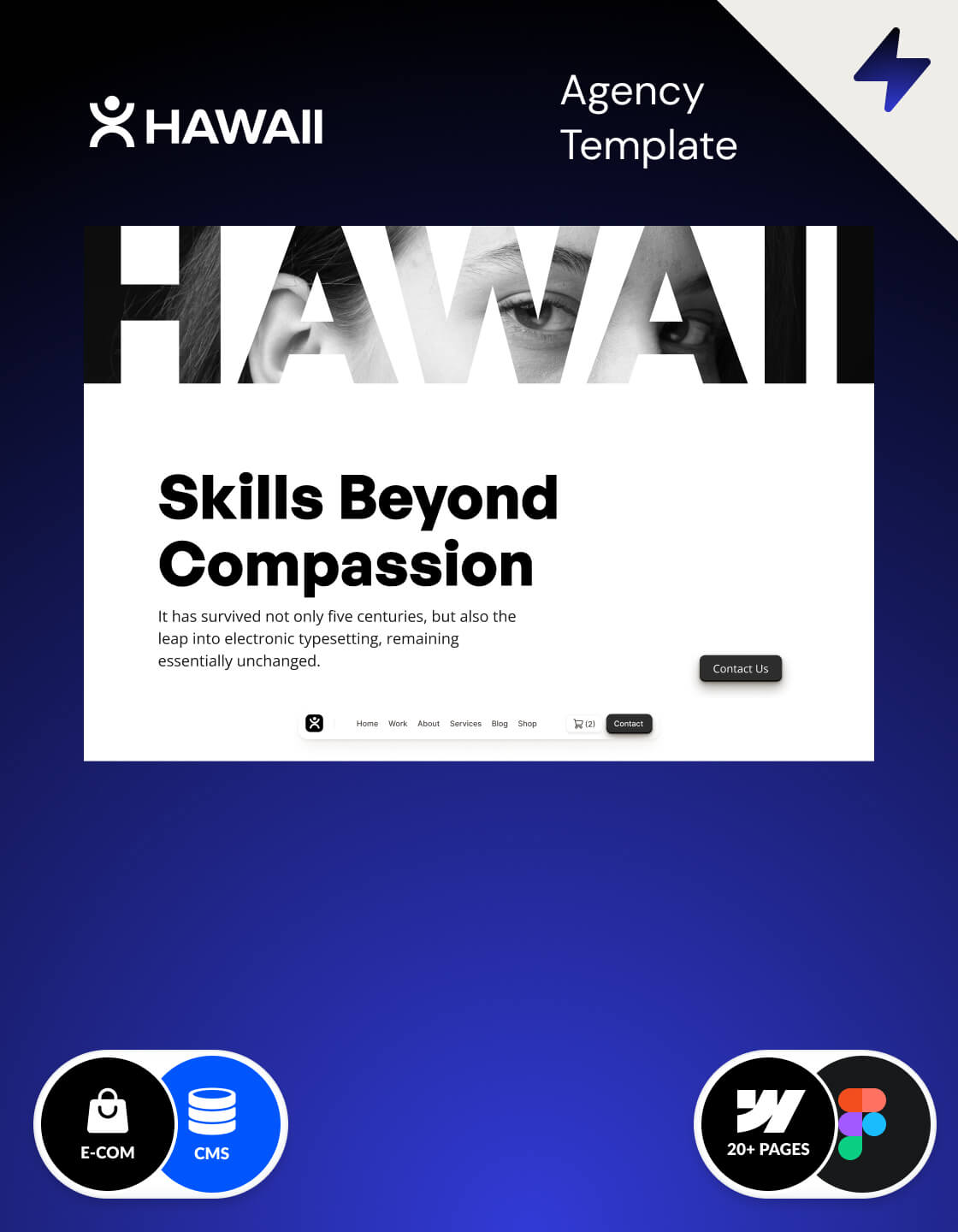
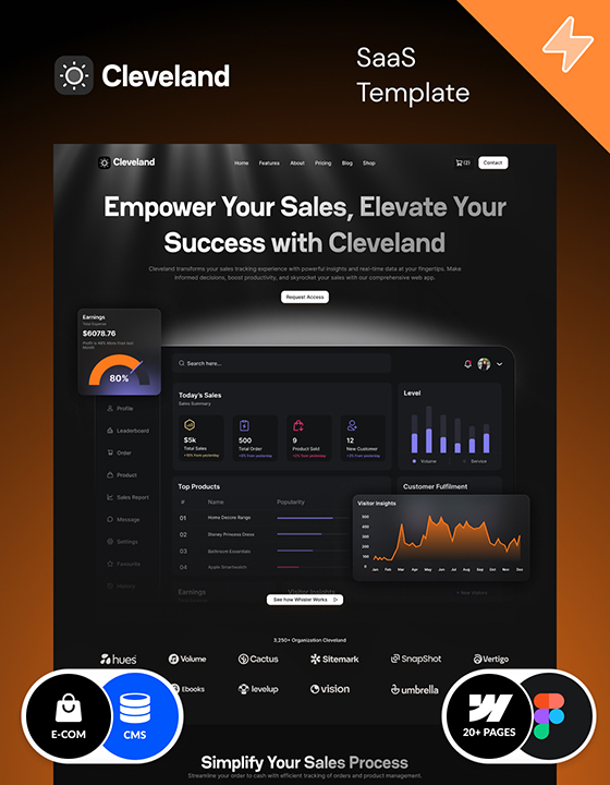
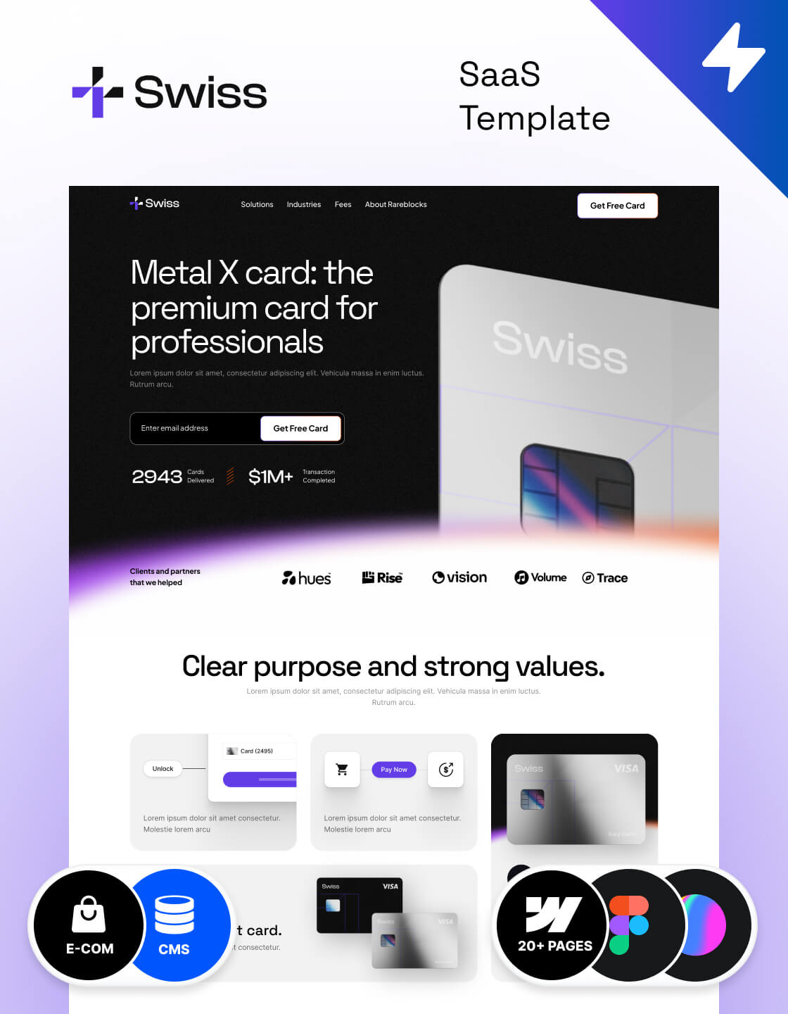
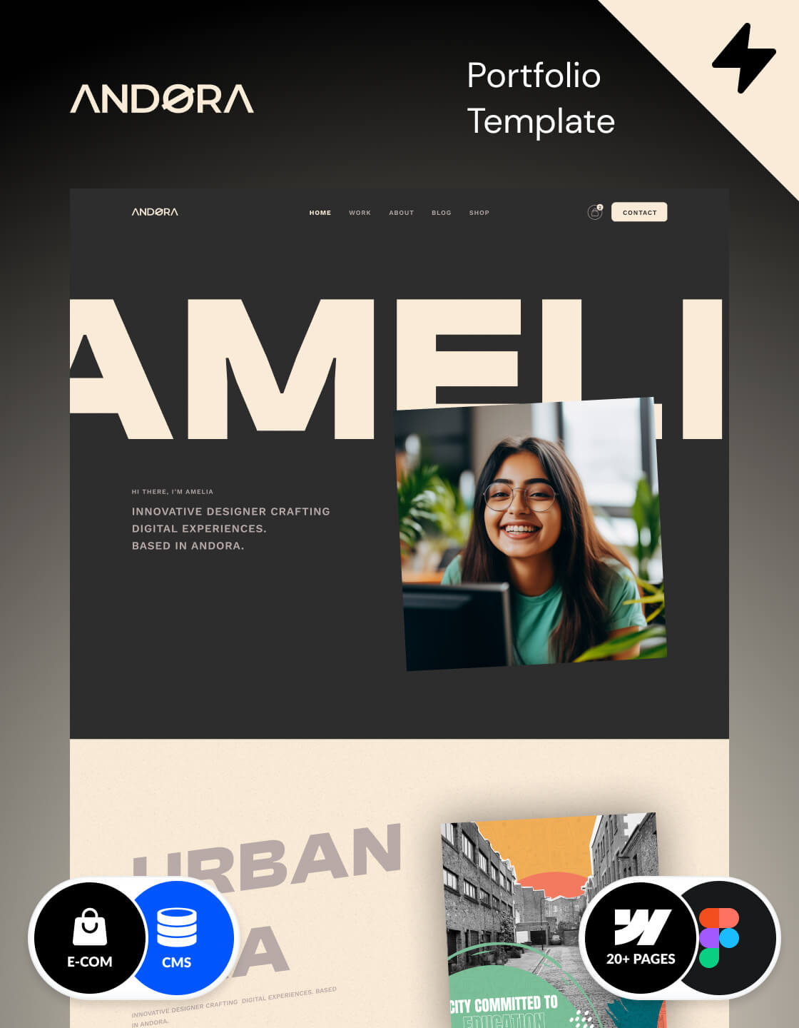
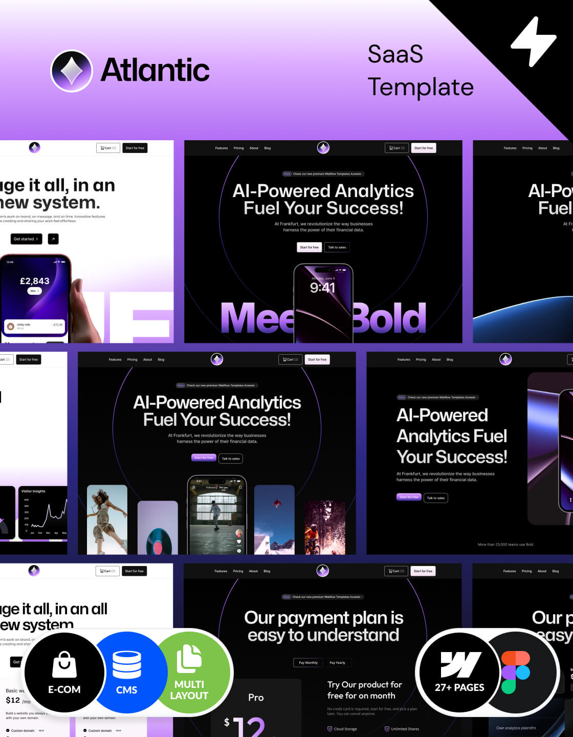
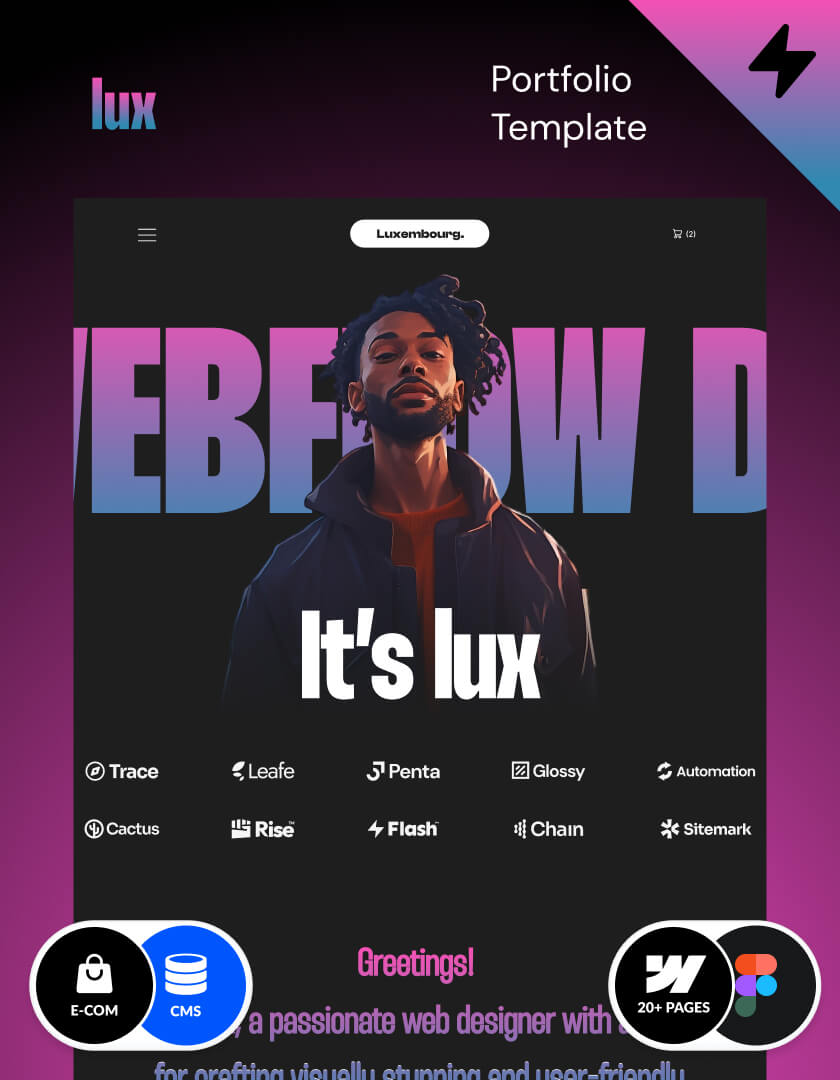
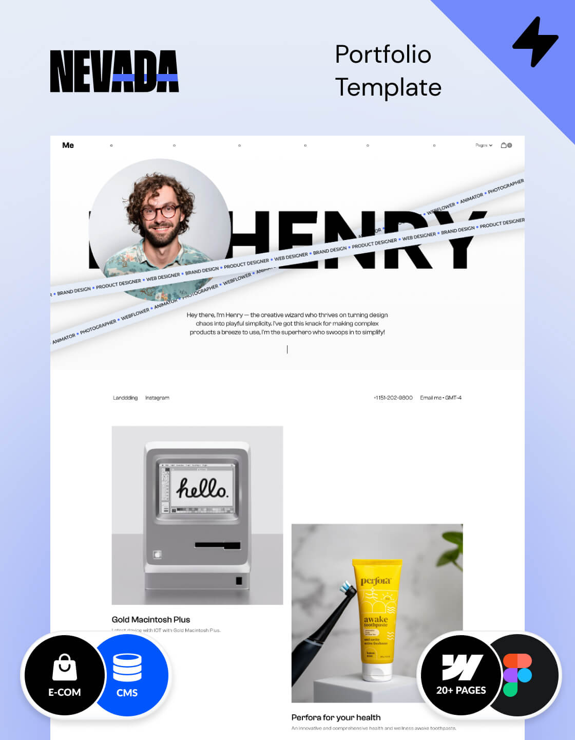
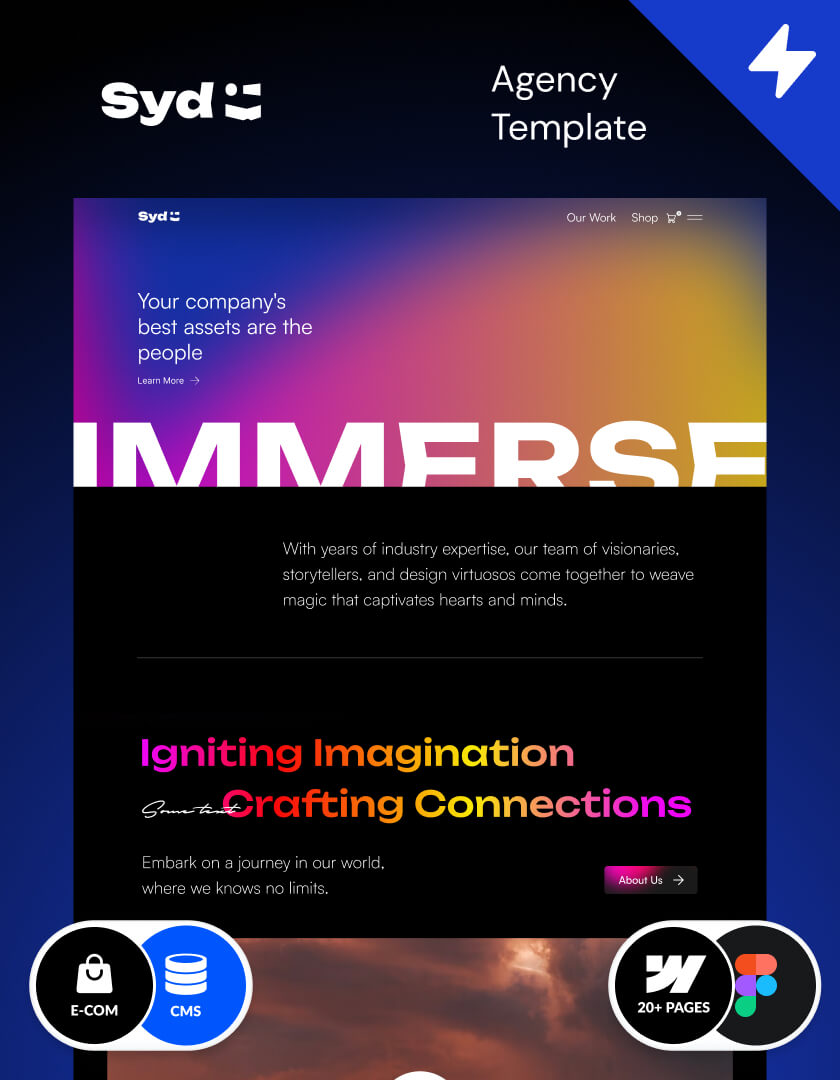
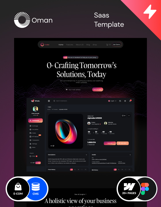
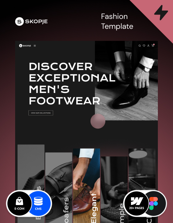
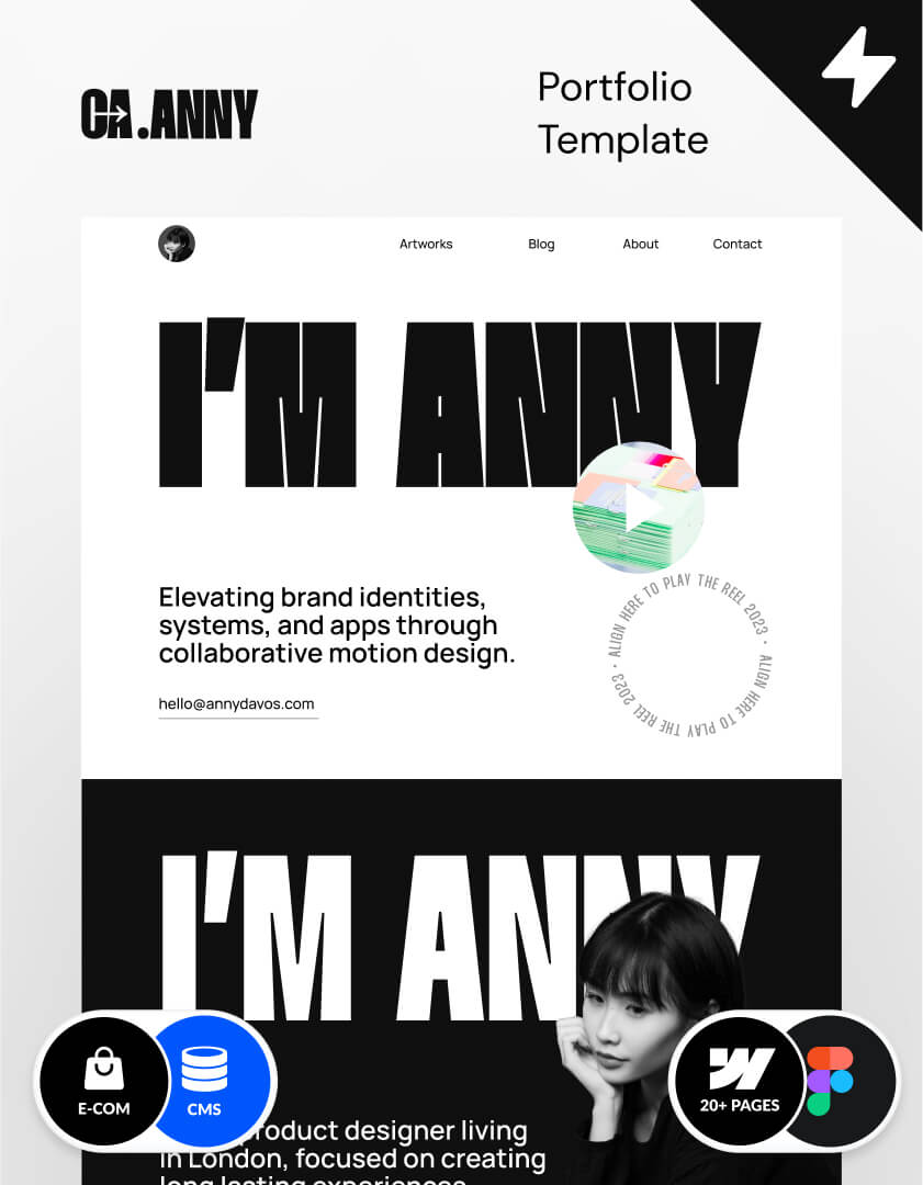
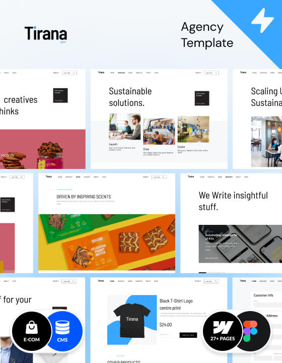
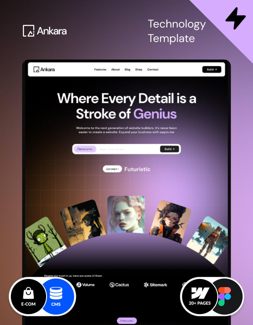
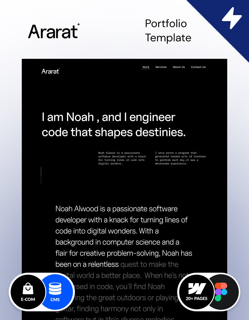
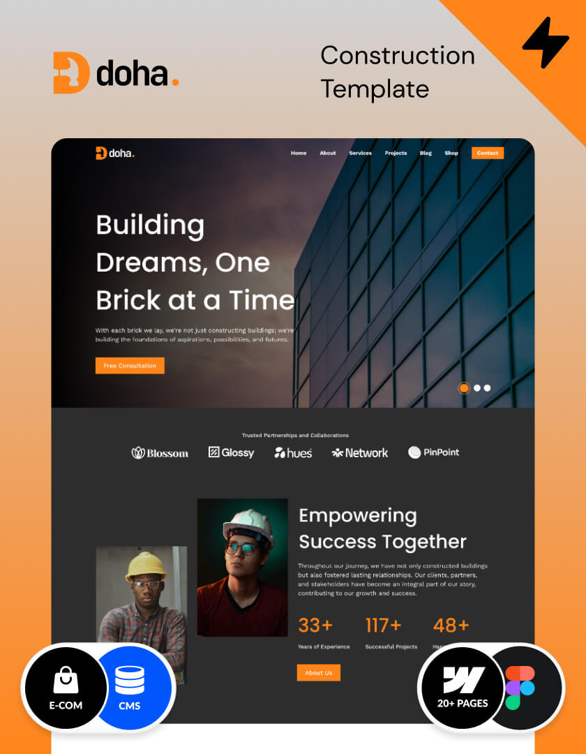
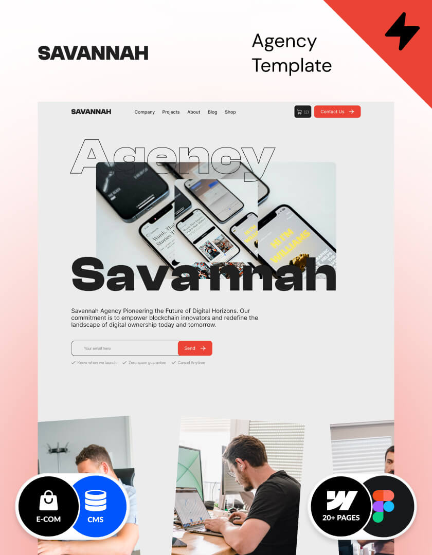
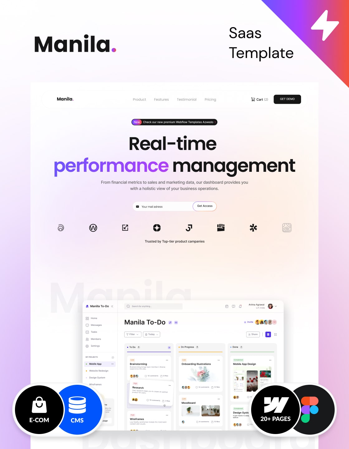
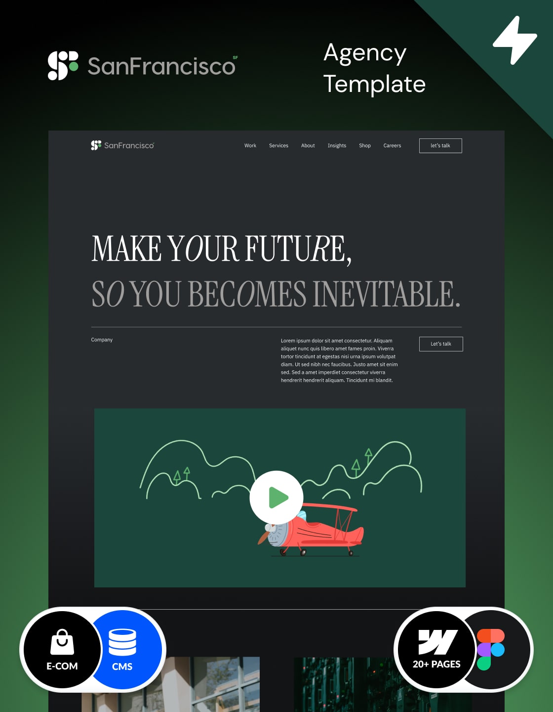
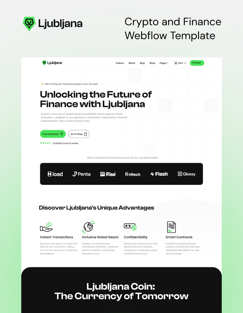
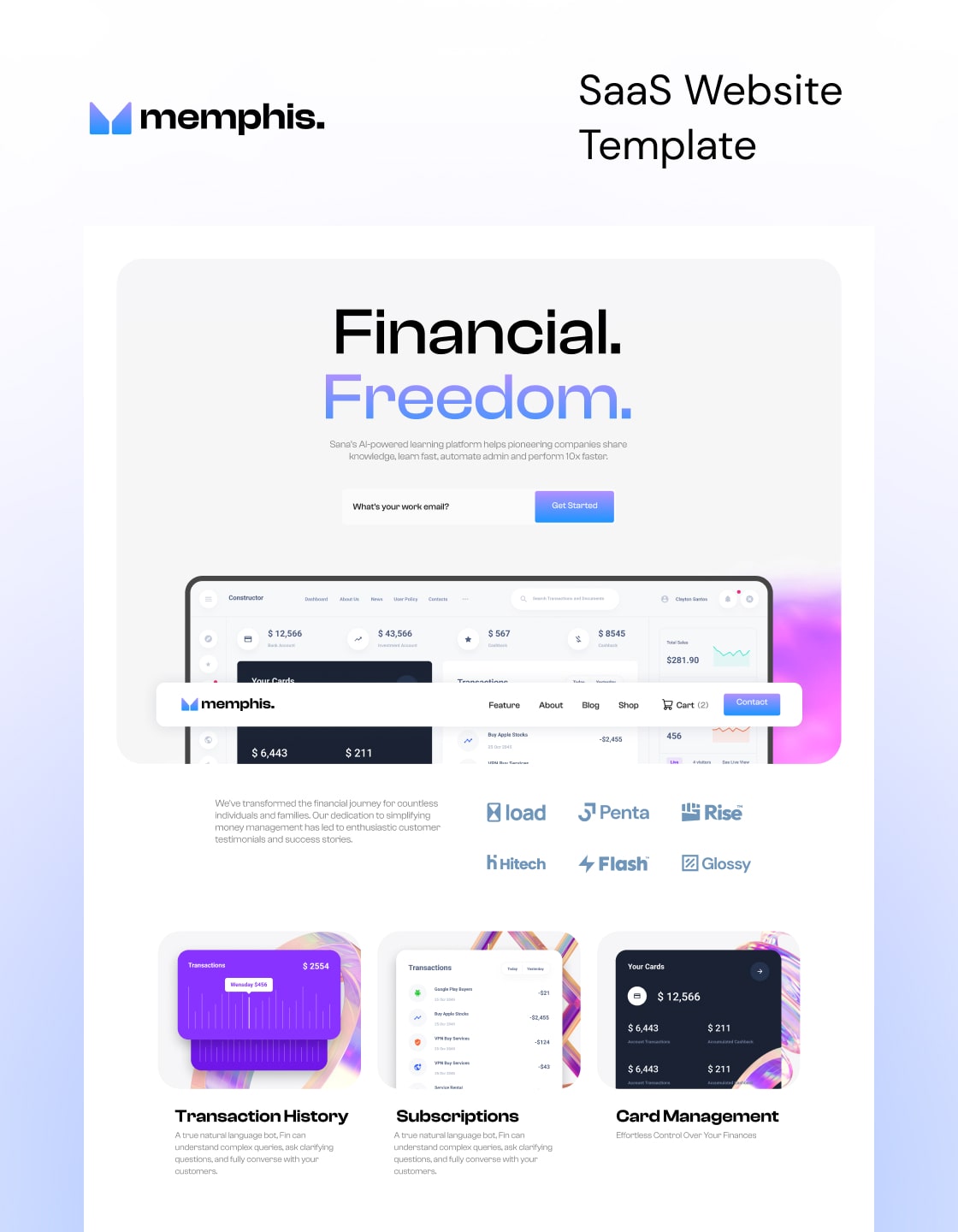
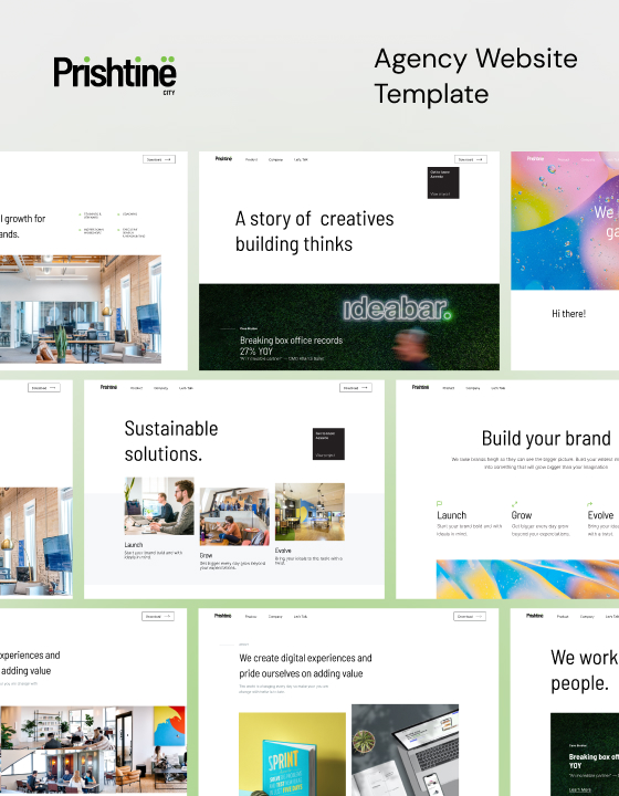
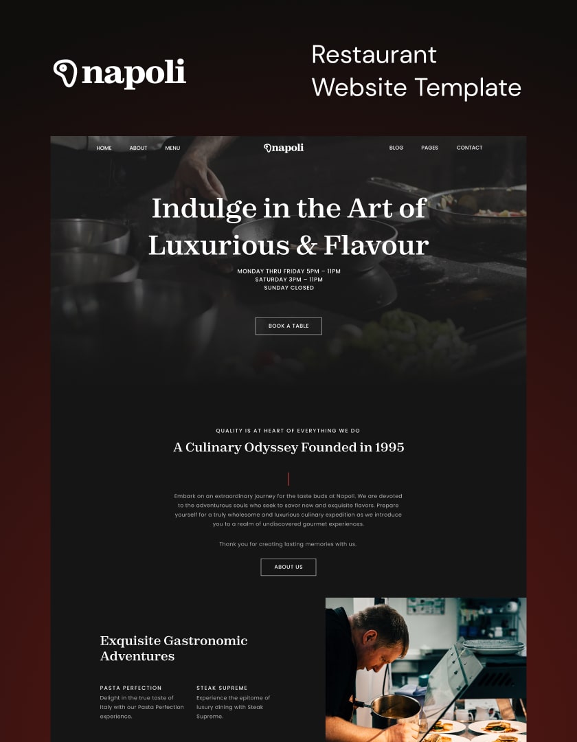
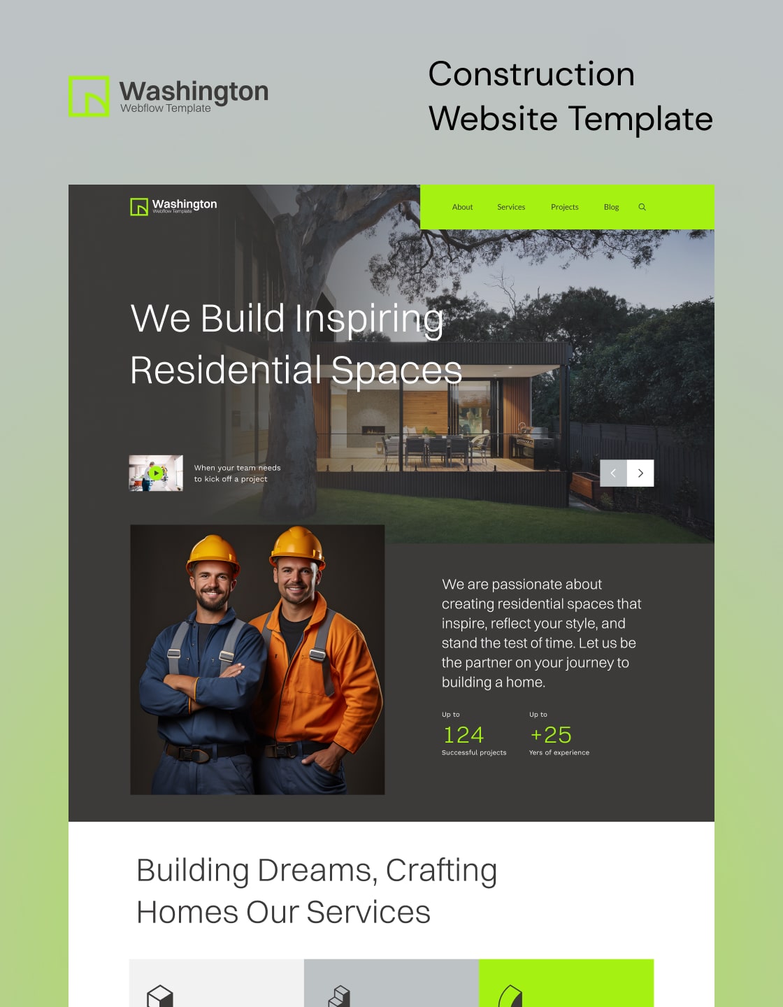
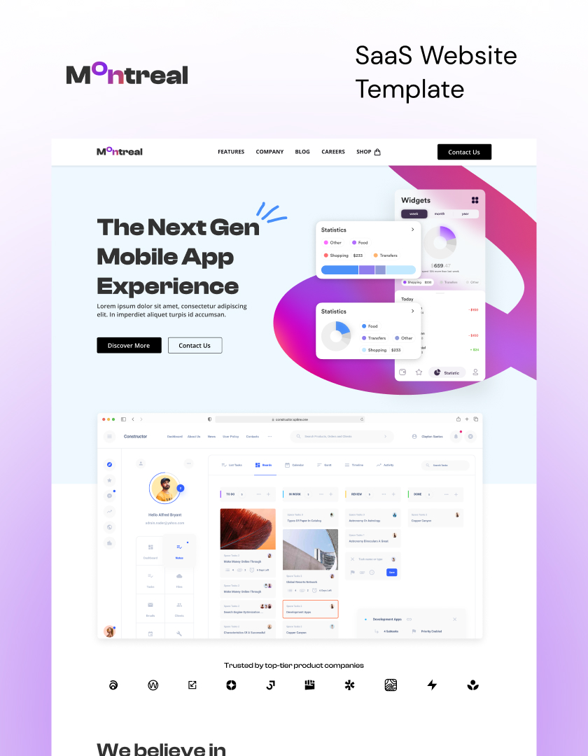
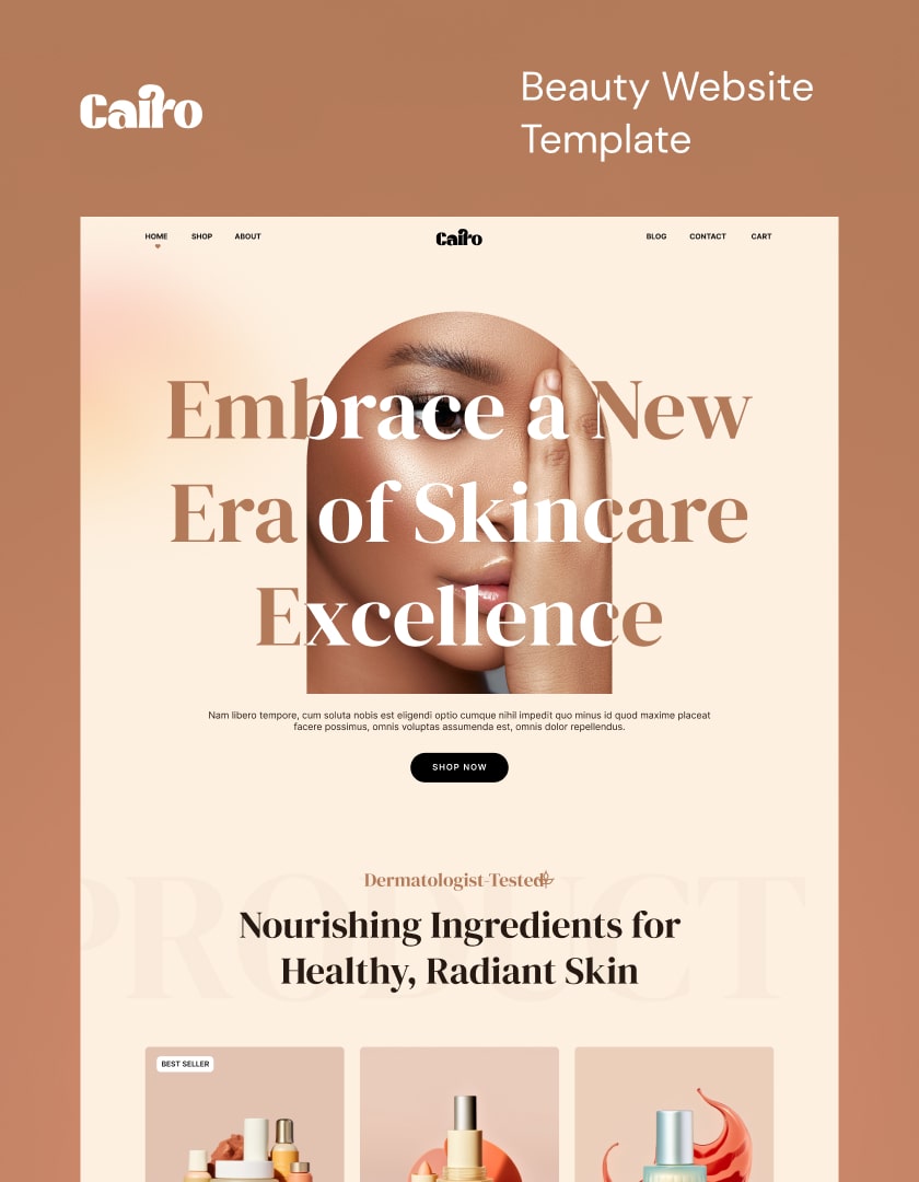
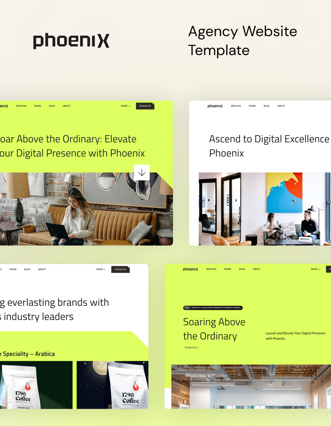
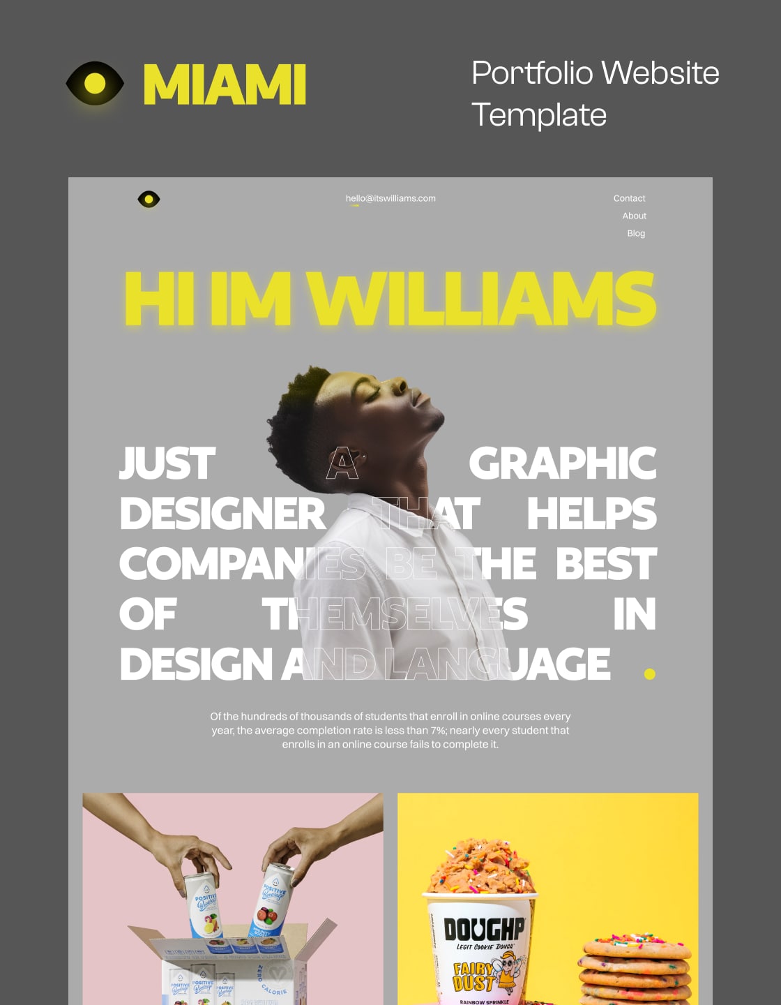
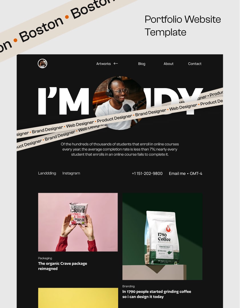
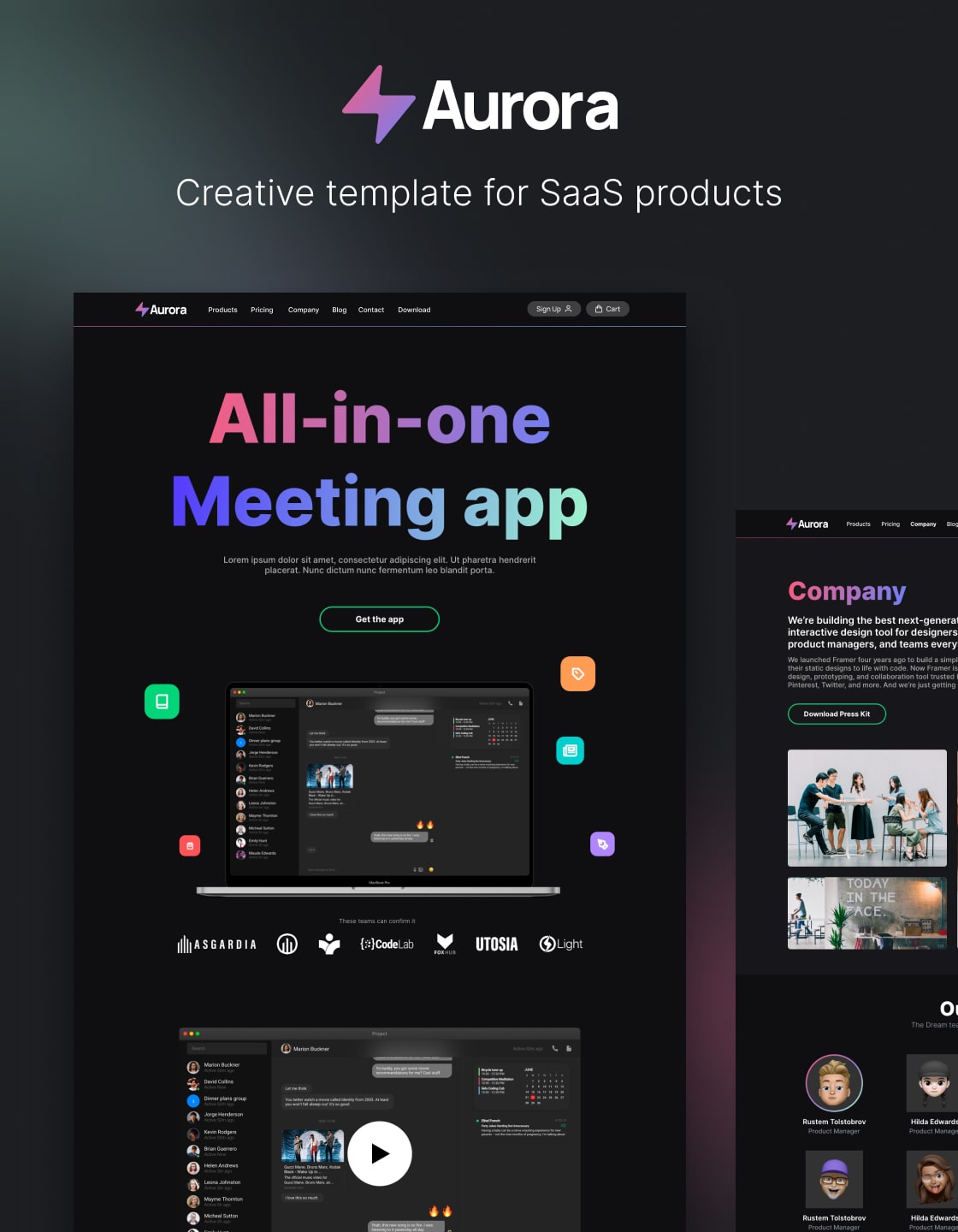
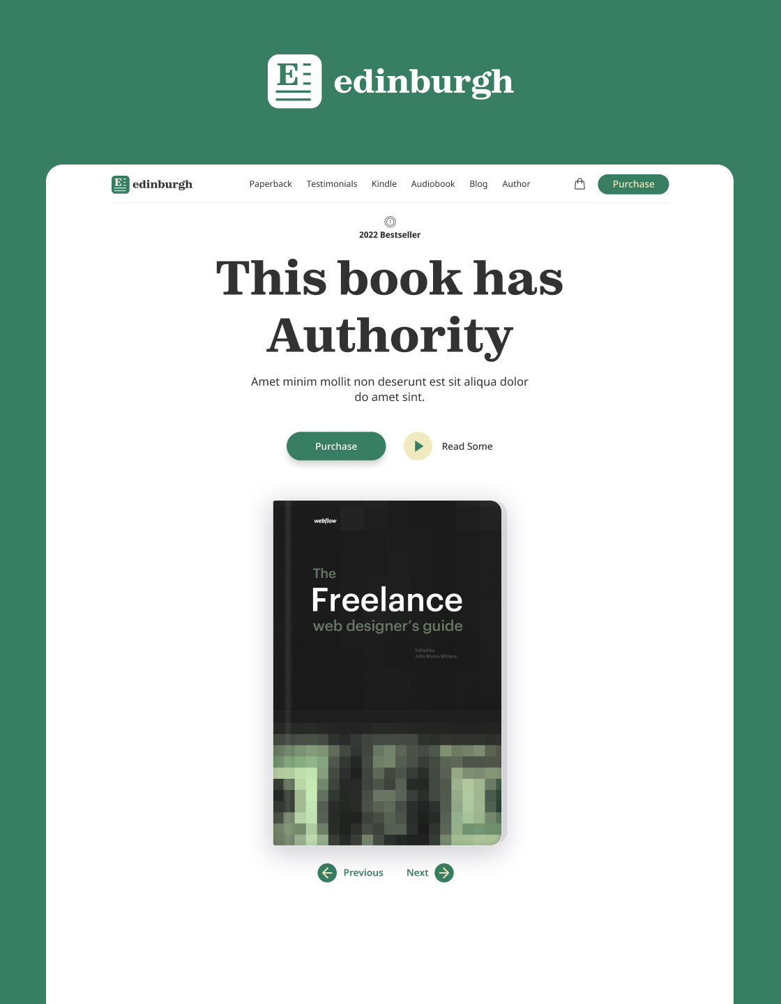
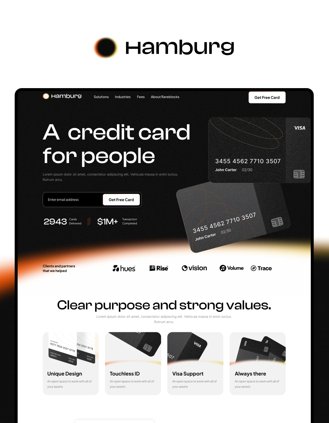
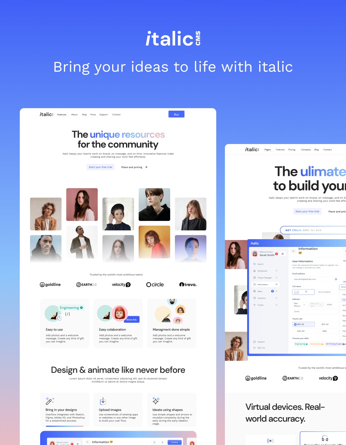
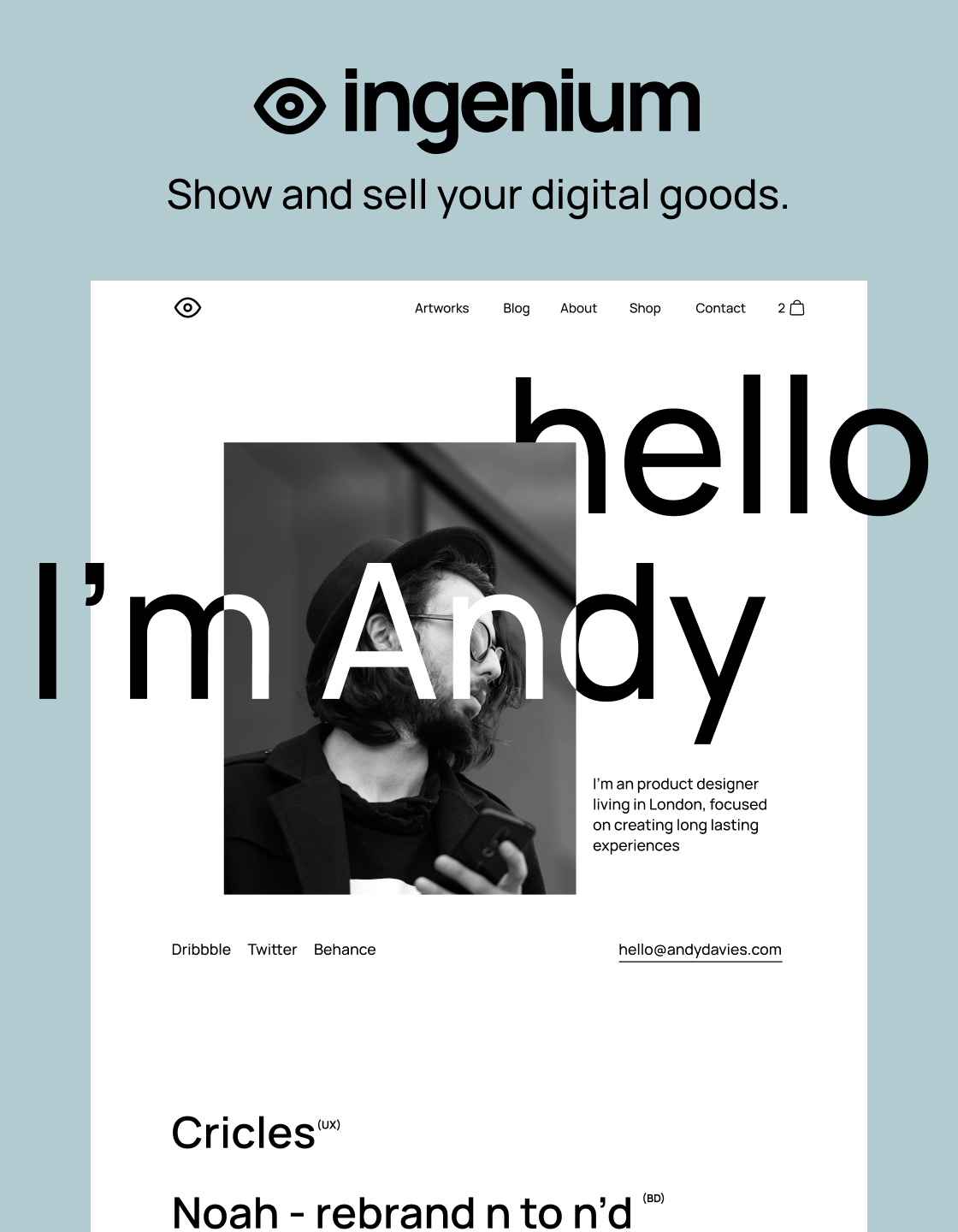
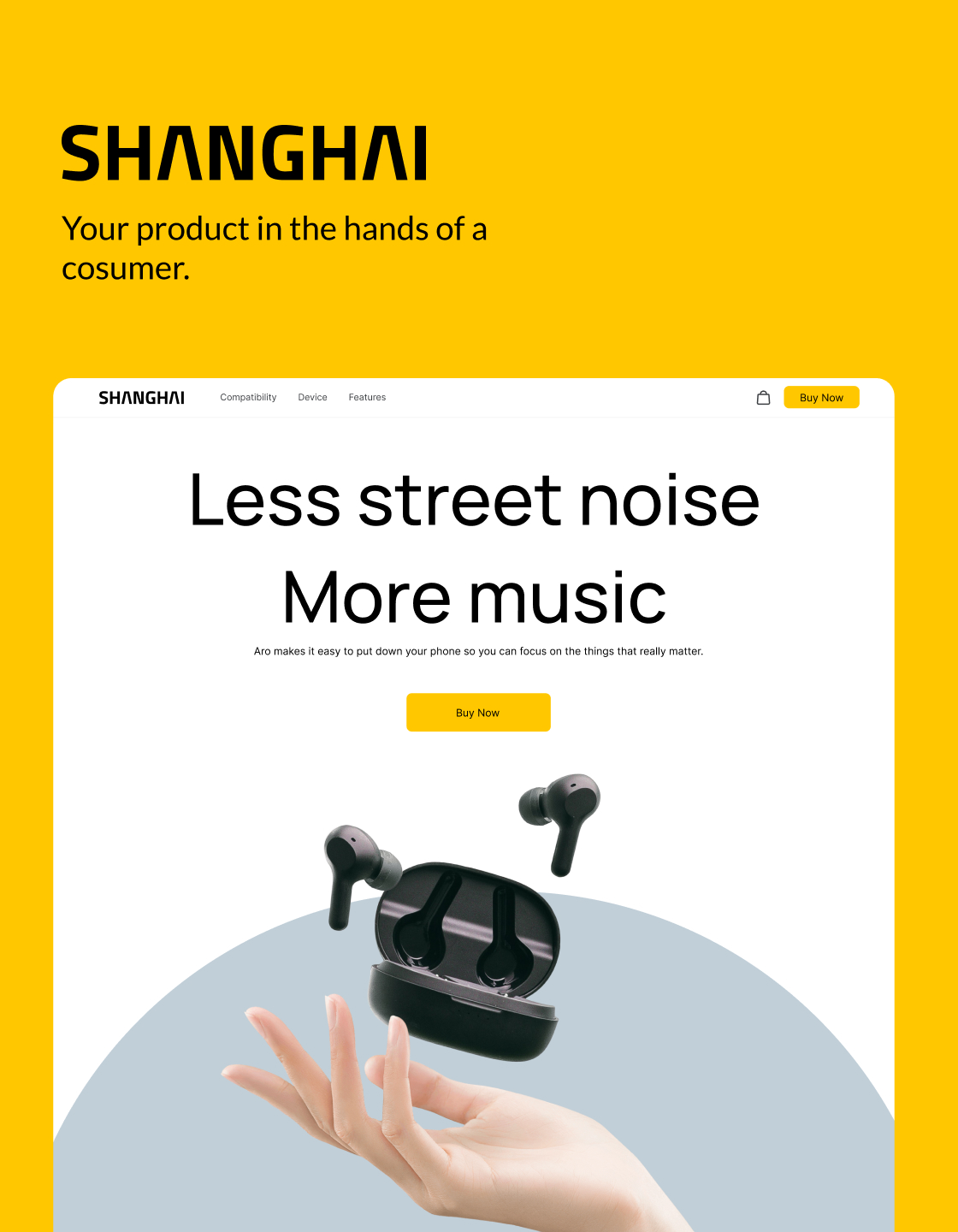
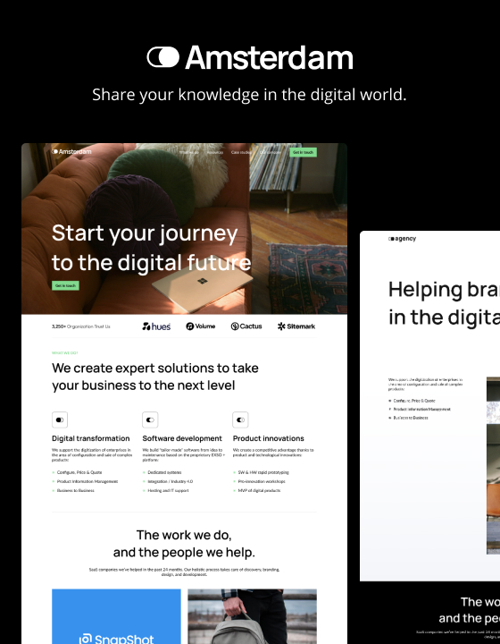
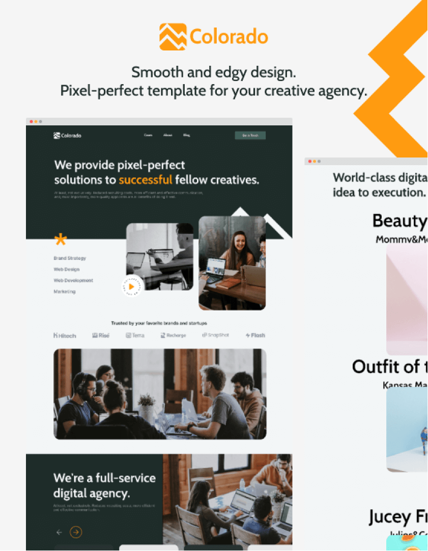
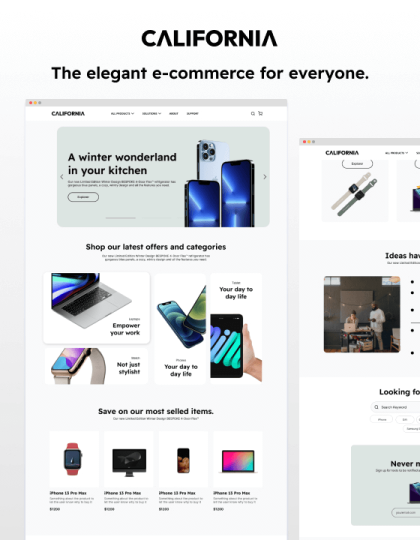
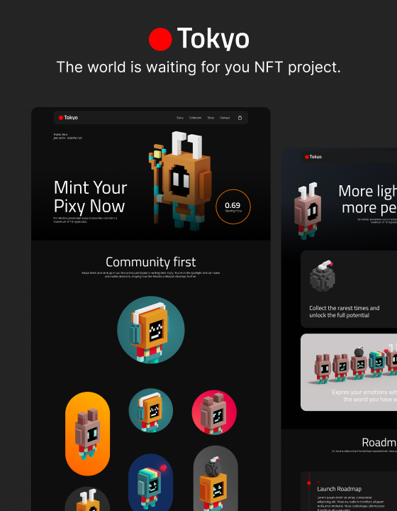
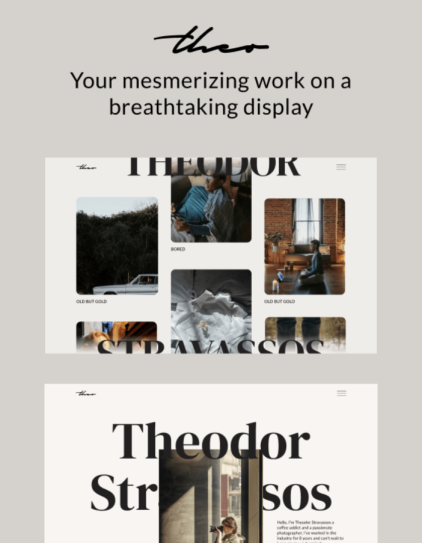
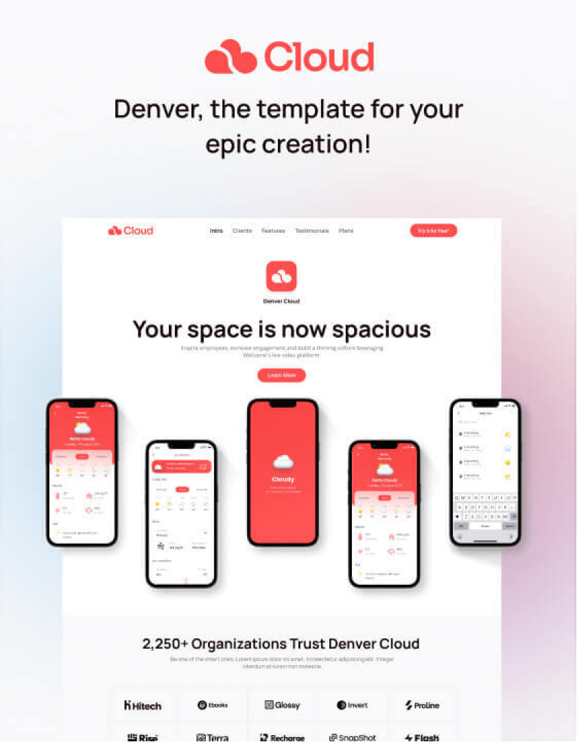
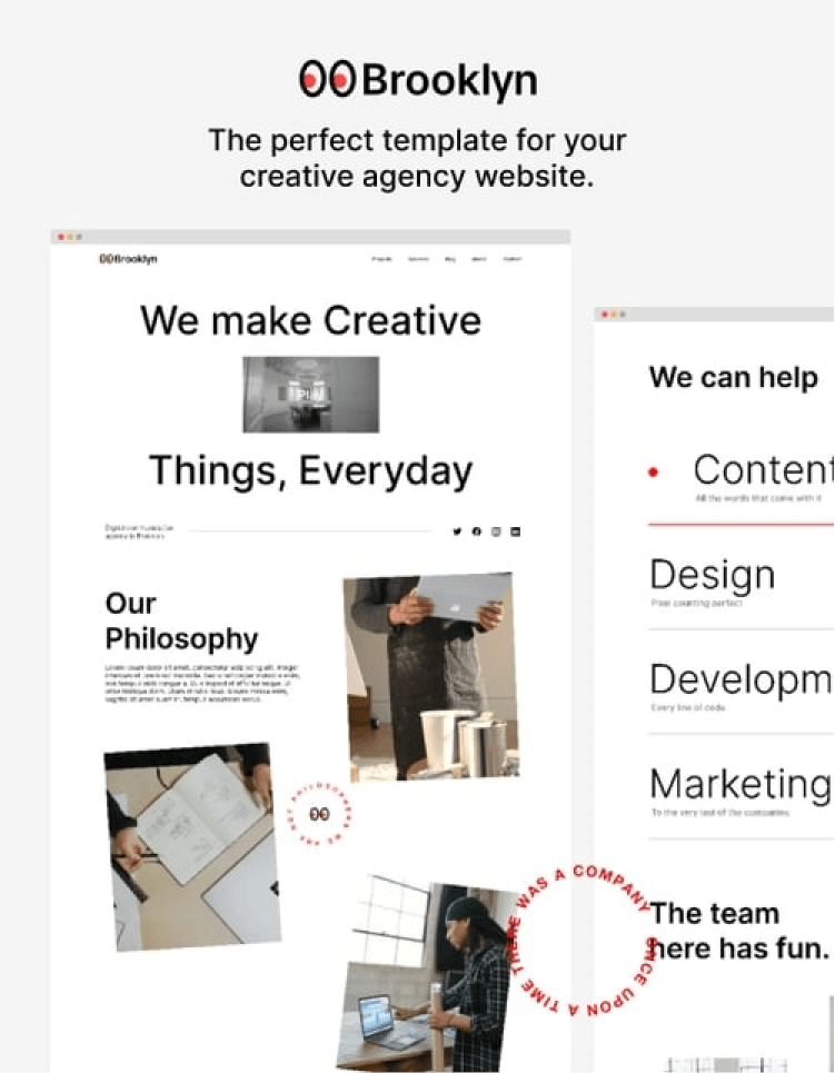
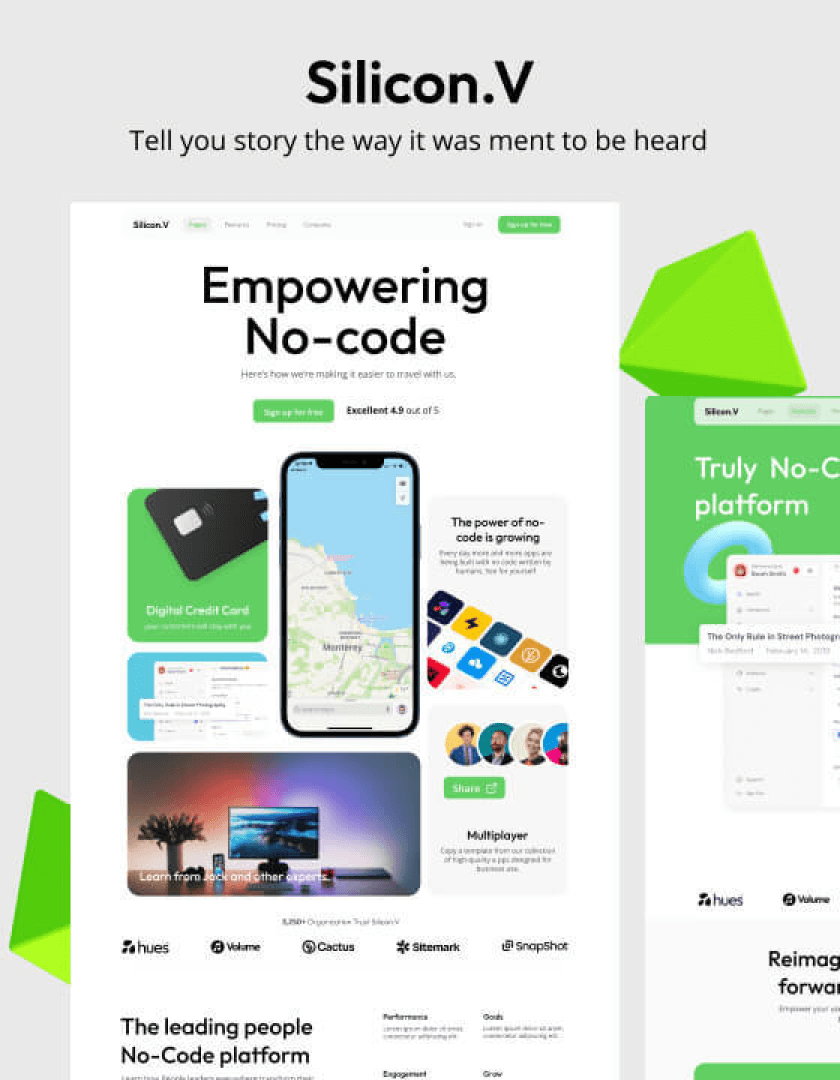
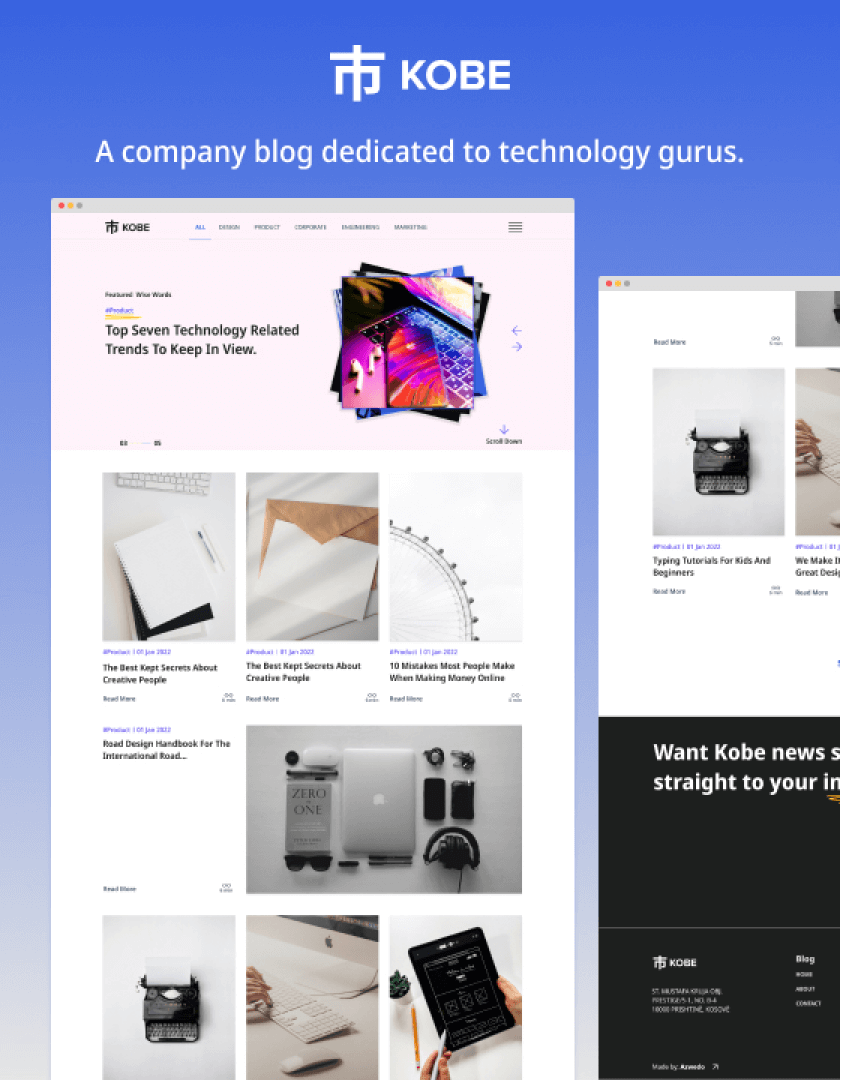
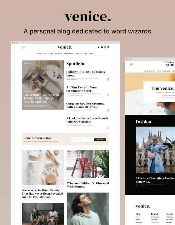
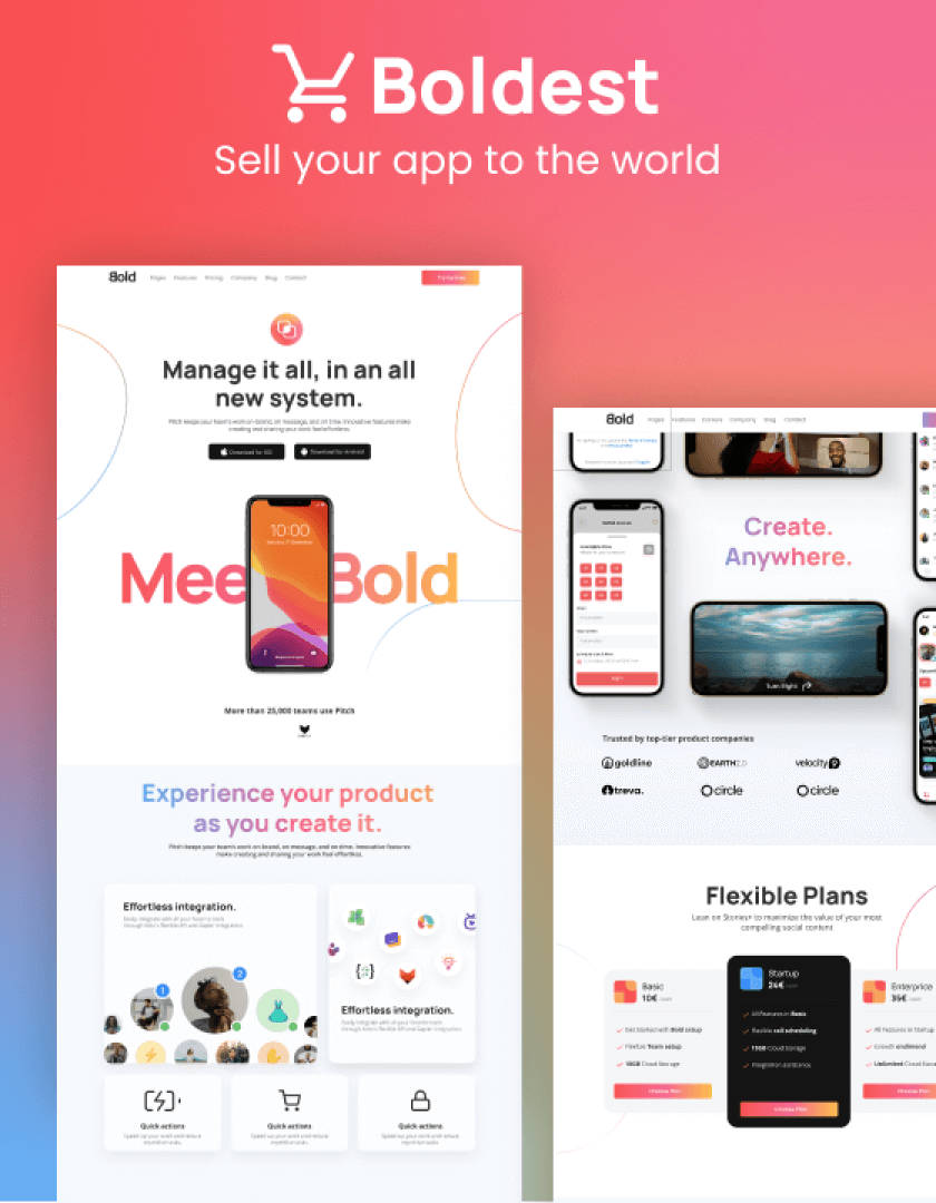
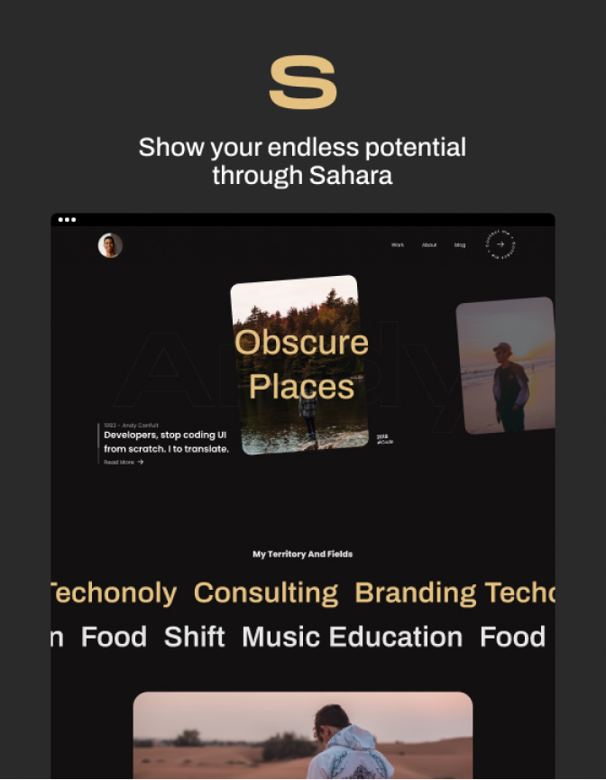
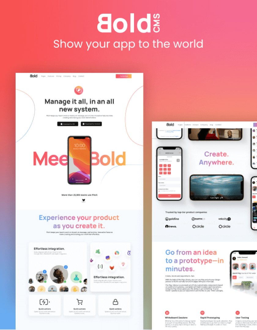
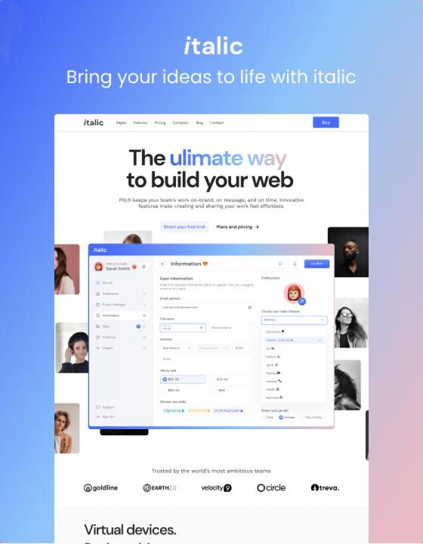
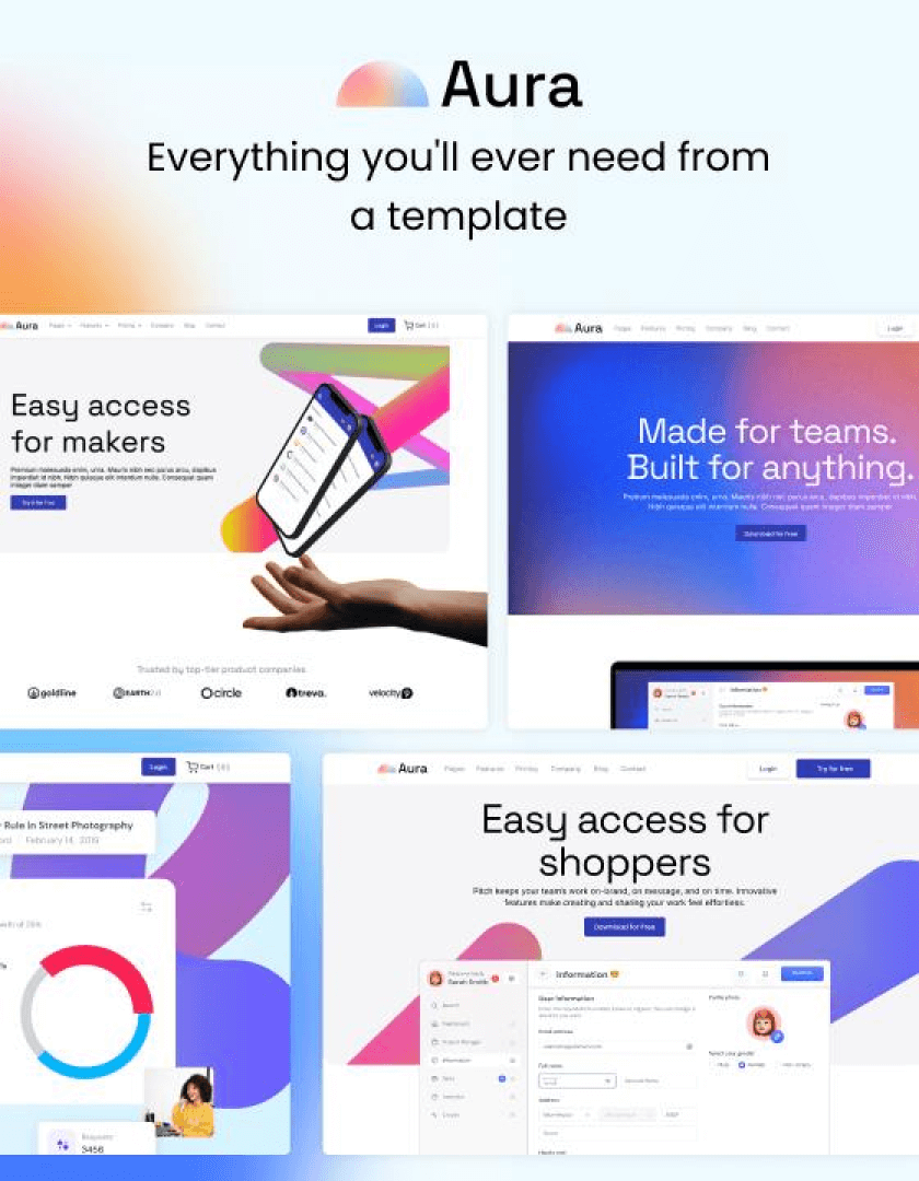
Other webflow templates


I choose wedoflows’ template for my advertising portfolio because it was a very unique, functional design. I appreciate the clean code and the UX thought that went into the template. Very content with the purchase! Thank you!

Sergio Fermin – Associate Creative Director
I bought for my startup the Italic and Aura designs. Both are beautiful!
L. Alexi - CEO
Hands down the best dynamic template source. The wedoflow templates stood out from all other templates. Clear typography, great choices of colors and fonts. Easy to work templates. And above all their after sale support was also great.
Just wanted to say I love your work and I think you’ve done an amazing job with your templates.
H. Haines
I recently bought a template from you and have been using it on Webflow. It is great, I love it!
J. Zapata
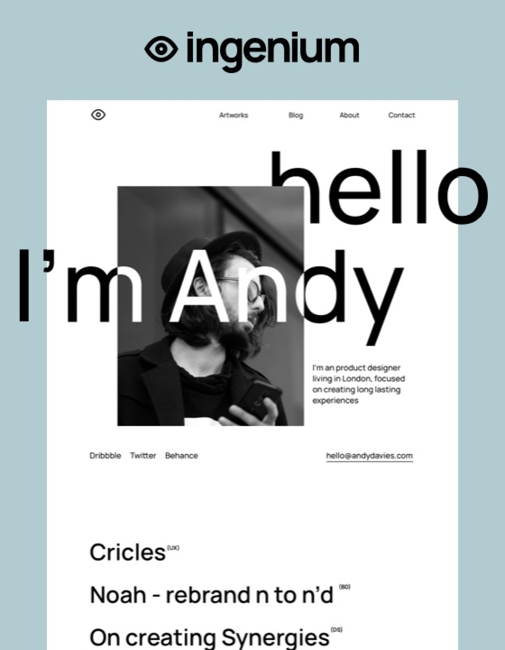
I really love the Ingenium Template.
J. Stohr


